
 ViewSwitch Properties

Properties in the View Designer
● itemEnabled
Specifies whether or not an event can be triggered by a user interaction.
● itemIcon
Standard icons for the various ViewSwitches:
Possible icons:
Value |
Visual Display |
Description |
blank |
|
Placeholder for the icon. This ensures that the correct indentation is performed if only entries in the ViewSwitch have an icon |
news |
|
Icon for displaying news |
none |
|
No icon display |
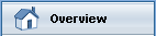
overview |
|
Icon for displaying an overview |
report |
|
Icon for displaying reports |
selfService |
|
Icon for displaying a self service |
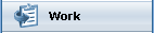
work |
|
Icon for displaying work-related things |


● itemSource
Bound to a context node containing the elements of ViewSwitch.
● itemText
Label text for the item.
● itemVisible
Visibility of the item.
This property
can be personalized by an administrator.
In personalization, this property
can be assigned the value false