
 DropDownByIndex
A DropDownByIndex UI element provides the user with a dropdown list box. You cannot select more than one entry from the selection list. The UI element consists of a text field, a button, and a selection list. Any list item already selected is displayed in the text field. When selecting the button, a list with all possible values is displayed.
Example of Use
If you want to create a table with dropdown lists, whereby each table row can have different values in its dropdown list, you should use DropDownByIndex.

To enable the
development of  accessible
applications, the label property is checked during the syntax
check.
accessible
applications, the label property is checked during the syntax
check.
If no label has been set, and no descriptive text has been specified for the appropriate bound context element in the ABAP Dictionary, the tooltip property is checked.
Examples of the Display
|
|
|

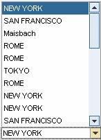
The dropdown list
box UI elements, DropDownByIndex and DropDownByKey, do
not differ from each other when displayed on the screen. However, the data binding model for the
DropDownByKey UI element has a completely different concept. More information: Data Binding
(for general information within Web Dynpro), Data Binding of User
Interface Element Properties, and Data Binding Using
Index and Key. You can find
more information about using dropdown list boxes with index data binding in AbstractDropDownByIndex.
Runtime Class |
Properties in View Designer
Name |
Type |
Initial Value |
Bindable |
ID |
STRING |
(automatic) |
No |
WDY_BOOLEAN |
false |
No |
|
WDY_BOOLEAN |
true |
Yes |
|
Translatable text |
|
No |
|
STRING |
|
No |
|
WDY_BOOLEAN |
false |
Yes |
|
WDUI_LEAD_SEL_CHNG_BEHVR |
auto |
No |
|
WDUI_STATE |
normal |
Yes |
|
Translatable text |
|
Mandatory |
|
WDUI_TEXT_DIRECTION |
inherit |
Yes |
|
Translatable text |
|
Yes |
|
WDUI_VISIBILITY |
visible |
Yes |
|
STRING |
|
Yes |
Events in View Designer
Name |
Other properties that can be inherited are defined in the associated higher-level classes. The associated UI elements are:
Dynamic Programming
For dynamic programming, the same properties, events and aggregations are available as in the View Designer. Bear in mind the different spellings.
Dynamic Programming of Properties
View Designer Name |
Runtime Name |
Type |
DESELECTABLE |
WDY_BOOLEAN |
|
ENABLED |
WDY_BOOLEAN |
|
EXPLANATION |
WDY_MD_TRANSLATABLE_TEXT |
|
LABEL_FOR |
STRING |
|
READ_ONLY |
WDY_BOOLEAN |
|
SELECTION_CHANGE_BEHAVIOUR |
WDUI_LEAD_SEL_CHNG_BEHVR |
|
selectionChangeBehaviour: auto |
CL_WD_DROPDOWN_BY_IDX=>E_SELECTION_CHANGE_BEHAVIOUR-AUTO |
|
selectionChangeBehaviour: manual |
CL_WD_DROPDOWN_BY_IDX=>E_SELECTION_CHANGE_BEHAVIOUR-MANUAL |
|
STATE |
WDUI_STATE |
|
state: normal |
CL_WD_DROPDOWN_BY_IDX=>E_STATE-NORMAL |
|
state: required |
CL_WD_DROPDOWN_BY_IDX=>E_STATE-REQUIRED |
|
TEXTS |
WDY_MD_TRANSLATABLE_TEXT |
|
TEXT_DIRECTION |
WDUI_TEXT_DIRECTION |
|
textDirection: inherit |
CL_WD_DROPDOWN_BY_IDX=>E_TEXT_DIRECTION-INHERIT |
|
textDirection: ltr |
CL_WD_DROPDOWN_BY_IDX=>E_TEXT_DIRECTION-LTR |
|
textDirection: rtl |
CL_WD_DROPDOWN_BY_IDX=>E_TEXT_DIRECTION-RTL |
|
TOOLTIP |
WDY_MD_TRANSLATABLE_TEXT |
|
VISIBLE |
WDUI_VISIBILITY |
|
visible: none |
CL_WD_DROPDOWN_BY_IDX=>E_VISIBLE-NONE |
|
visible: visible |
CL_WD_DROPDOWN_BY_IDX=>E_VISIBLE-VISIBLE |
|
WIDTH |
STRING |
|
Dynamic Programming of Events
View Designer Name |
Runtime Name |
ON_SELECT |
Example
There is a system example for this UI element in the DEMO_UIEL_STD_SELECTION component in the DEMO_UIEL_DROPDOWN_BY_IDX application.