
 Inserting a Simple Value Selector
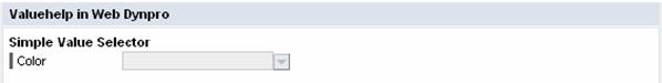
The following graphic illustrates the functions of the simple value selector:

At design time, a simple data type Simple Type is assigned to a value attribute that is contained in the Java Dictionary. If the selectedKeyproperty of a DropDownByKey UI element is bound to this value attribute, the dropdown list box – that is, the simple value selector – is automatically filled with entries in the view layout at runtime. These entries are stored in the data type of the value attribute. The value set is a list of key/value pairs. Language-independent key values are always used in the source text, whereas the language-dependent display texts are displayed in the dropdown list box.

Note that there is no data binding in the view context for the values to be displayed. Only the selected value is bound; all other information is provided by the data type of the value attribute.
This is a simple way to display the metadata for a value attribute (type information of a Simple Type, such as constants or label text) on the user interface.

In this example, the data type of the value attribute is statically defined at runtime. As described in the following procedure, you can also dynamically modify the data type of a value attribute at runtime while using the simple value selector. The constants to be displayed are contained in the data type metadata of the value attribute.
Procedure
You insert the simple value selector into the Main view as follows:
● Design the view layout
● Defining a simple data type Simple Type Color in the Java Dictionary
● Declare a value attribute Color of the type Color in the context of the view controller
● Data binding between the DropDownByKey UI element and the value attribute Color
Designing the View Layout
Use the following UI element structure in the Main view:
Layout of the Main View |
|
|
|
Property |
Value |
Container RootUIElementContainer of type TransparentContainer |
|
Properties of Transparent Container - layout |
GridLayout |
Group ValuehelpGroup of type Group in UI element RootUIElementContainer |
|
Properties of Group – design |
Sapcolor |
Properties of Group - layout |
GridLayout |
Properties of Group – width |
75% |
Layout - colCount |
2 |
LayoutData – hAlign |
Center |
Caption ValuehelpGroup_header of type Caption in UI element ValuehelpGroup |
|
Properties of Caption - text |
Valuehelp in Web Dynpro |
Text SVSHeader of type TextView in UI element ValuehelpGroup |
|
Properties of TextView – design |
header3 |
Properties of TextView – text |
Simple Value Selector |
LayoutData - colSpan |
2 |
Field label SVSLabel of type Label in UI element ValuehelpGroup |
|
Properties of Label – labelFor |
SimpleValueSelector (in Auswahlliste)
Wählen Sie den Wert SimpleValueSelector für die Eigenschaft labelFor aus, nachdem Sie das nachfolgende Oberflächenelement namens SimpleValueSelector eingefügt haben! |
Simple value selector SimpleValueSelector of type DropDownByKey in UI element ValuehelpGroup |
|

Note that the text property of the Label UI element SVSLabel does not have to be defined. At runtime, the label text is specified using the data type information of the context attribute to which the DropDownByKey UI element of the label is bound. You do not therefore need to specify this DropDownByKey UI element for this Label UI element SVSLabel - using the labelFor property - until design time.
Defining the Simple Type Color in the Java Dictionary
...
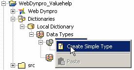
1. Open the dialog box for defining new data types of type Simple Type in the Java Dictionary. To do so, choose Create Simple Type in the context menu for the subnode, under Dictionaries ® Local Dictionary ® Data Types ® Simple Types.
2. Enter the following data in the New Simple Type dialog box:
○ Simple Type name: Color
○ Simple type package: com.sap.tc.webdynpro.tutorials.valuehelp.simpletypes
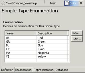
3. In the user interface for data type color, select the Enumeration tab and the following key/value pairs by repeatedly choosing New: RE – Red, GR – Green, BL – Blue, CY – Cyan, MA – Magenta, YE – Yellow. The values of the Description column are used as the display texts in the simple value selector. The keys, however, are used in the source text.
○
4. Switch to the Representation tab and enter Colors in the Field Label field.
At runtime, binding mechanisms enable you to use the value of the Field Label property (metadata information of data type Simple Type) as a label text for a UI element that can be filled with entries – for example, UI element DropDownByKey, UI element TextEdit or UI element InputField.
Declaring a Value Attribute of Type Color
...
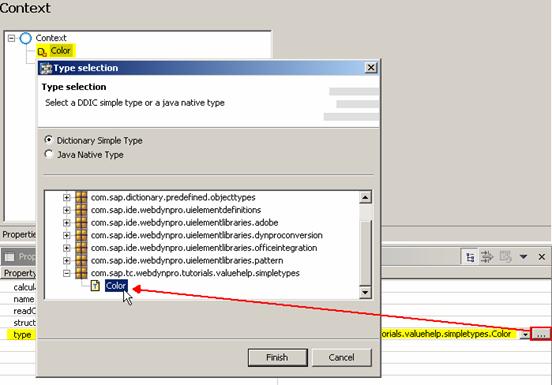
1. Select the Context tab in the user interface of the Main view.
2. Add a value attribute and call it Color.
3.
In the
corresponding Properties tab, assign
data type Simple Type
Color as a value
to property type. Open the dialog
box for selecting a simple data type in the Java Directory by clicking the
 button at the edge of the right column of the
dialog box.
button at the edge of the right column of the
dialog box.
4.
Binding a DropDownByKey UI Element to the View Context
Finally, you bind the selectedKey property of the DropDownByKey UI element to the previously defined Color value attribute of the type Color.
- Select the Layout tab in the user interface of the Main view.
-
Choose the
node
 SimpleValueSelector[DropDownByKey] in the
outline window.
SimpleValueSelector[DropDownByKey] in the
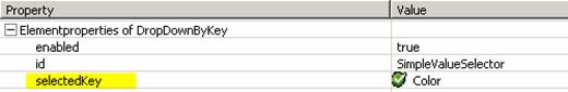
outline window. - In the Properties tab, bind property selectedKey to value attribute Color.
Result
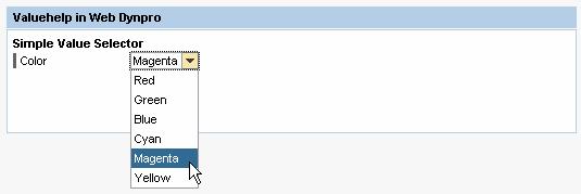
You can now use the simple value selector in this example application at runtime:
...
1. Regenerate the application files using Rebuild project.
2. In the Web Dynpro application context menu, choose Deploy new archive and Run.
 For a larger number of constants, you need to
use the extended value
selector.
For a larger number of constants, you need to
use the extended value
selector.