
 Class 2
Chart Types
Class 2
Chart Types 
Chart Types
The XY scatter chart, time scatter chart, and histogram chart types belong to class 2.
Structure of the Data Provider
You build the underlying table of a chart type of class 2 as follows:
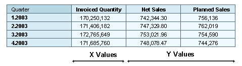
· The first data column contains the values to be entered on the X axis.
· The Y values are assigned to the remaining data columns. These data columns are converted into data series. The number of data series in the chart is thus computed from the total number of data columns minus 1.
The X value of a data point is always defined from the first data column. The Y value of a data point is defined from one of the remaining data columns, depending on the data series to which the data point belongs.
 Data providers for histograms need a special structure that is described
there.
Data providers for histograms need a special structure that is described
there.
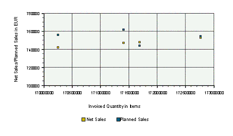
XY scatter chart
In an XY scatter chart, either the relationship between numeric values is displayed in several data series or two groups of numbers are entered as a row of XY coordinates. This chart type displays irregular intervals (clusters) and is normally used for scientific data.
Both axes of an XY scatter chart are value axes. In other chart types, the X axis is used to show categories.
Data Provider
Chart
Special
features
You can fill the areas between two points of a data series, almost as if the chart were an area chart. To do so, choose Point ® Filled.
Time Scatter Chart
The time scatter chart is similar to an XY scatter chart. The x value can be a date or time value.
Data Provider
Chart
Special features
You can create a time scatter chart with time or date values.
You can set up to three different time axes, for example, one for years, one for quarters, and one for months. To do this, choose TimeAxis ® Axis ® LineType1 to LineType3.
You can use LineFormat1 to LineFormat3 to define the format in which the time specifications are to be displayed. You can use the property LineStep1 to LineStep3 to set the intervals between time units. The following abbreviations can be used for the time specifications:
D = day, M = month, Y = year, W = week, Q = quarter, h = hour, m = minute, s = second.
Examples of Time Axis Formatting
Time |
Syntax |
Result |
23. August 2004 |
DD. MMM YYYY |
23. Aug 2004 |
23. August 2004 |
MM-DD-YYYY |
08-23-2004 |
23. August 2004 |
DDD MMM YY |
Mon Aug 04 |
23. August 2004 |
MMM W |
Aug 35 |
23. August 2004 |
W YY |
35 04 |
23. August 2004 |
Q.YY |
3.04 |
23. August 2004 |
D |
23 |
23. August 2004 |
DD |
23 |
23. August 2004 |
DDD |
Mon |
23. August 2004 |
DDDD |
Monday |
23. August 2004 |
M |
8 |
23. August 2004 |
MM |
08 |
23. August 2004 |
MMM |
Aug |
23. August 2004 |
MMMM |
August |
23. August 2004 |
Q |
3 |
12:34:00 |
hh:mm:ss |
12:34:00 |
12:34:00 |
hh:mm |
12:34 |
You can fill the area beneath a data series by choosing TimeScatter ® Filled.
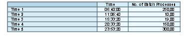
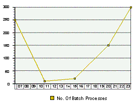
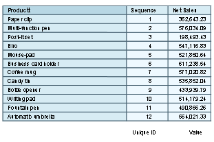
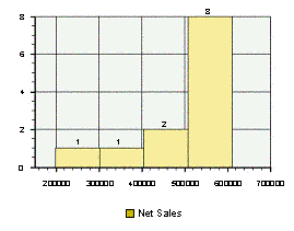
Histogram
The frequency of a characteristic is displayed in a histogram, for example the sales revenue for a product group. The frequency is divided into classes, where each class corresponds to a column in the histogram.
Categories and value ranges are entered on the X axis and the number of corresponding values on the Y axis in a histogram.
Data Provider
Chart
Special feature
To be displayed correctly, a histogram needs one data source with exactly the structure shown above. The first data column contains only unique numeric values that do not necessarily need to be sorted. The second data column contains the values that are sorted into the classes of the histogram.
You can control the number of classes by choosing Histogram ® Classes ® <required number of classes>.
See also:
Adding, Changing and Removing Trend Lines