
Multiple Selection Lists
Multiple selection lists are used to choose
as many options as desired from any number of options.
As multiple-selection lists are not an independent element of SAP GUI, they are currently copied by step loops.
Multiple-selection lists can occur independently and appear in a separate dialog box. They can also be a part of primary windows.
Checkboxes
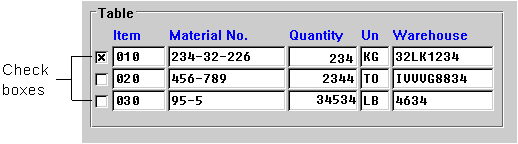
If several lines can be selected at a time in a table, the selection fields are to be displayed as
Checkboxes (Control Element) (see Technical Notes).Checkboxes for selecting table entries are positioned to the left of the respective line, with no space between them and the first field of the table entry (see below).
Checkboxes (Control Element) can also appear in other columns in the table (horizontally, that is to say) and are then to be used as in matrices (see below).Arrangement
The entries of the selection list are listed one below the other.
If the list exceeds the size of the window,
Scroll Bars (Control Element) are to be provided.Headings
If the list is displayed in a separate dialog box, the guidelines specified under
Title Bar apply with regard to the design of the header line.Column headers are only used for multiple column tables or for one-column tables, if the title bar does not explain the table contents.
Checkboxes (Control Element) do not have a column header.
Edit Flag
Due to technical reasons, you cannot enter an asterisk "*" into
Checkboxes (Control Element) at this time. To do this, a separate column has to be implemented (flag "FixA"). This column should be positioned before the checkbox (see Selection Methods - Overview).
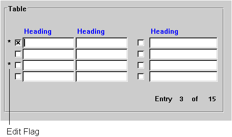
The Edit flag appears in a separate column
A selected entry is to be
highlighted by the task. To achieve immediate highlighting, the F9 functionality is to be supported in addition to the mouse click.