
Use, Appearance and Control
Use
Pushbuttons with no fixed position in the work area of a screen initiate functions which refer to individual fields, groups of fields, tables or lists an/or parts of them. For example, you can call detailed information on a field by pressing a pushbutton.
Further pushbuttons are predefined elements in the
Application Toolbar (Control Element) and in the Standard Toolbar.Appearance
Pushbuttons may show text alone, text and icon, or solely an icon.
Pushbuttons with Icons
Icons need less room than icons. Therefore, use only pushbuttons with icons alone for the functions describes below. If the user positions the mouse cursor on a pushbutton, the system will - after a short delay - show its meaning in a small Quickinfo popup. Add text to icons only as an exception.
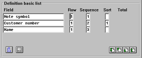
Example for pushbuttons with icons
Define the width of pushbuttons as follows:
Realization
The platform-specific appearance is used for pushbuttons.
Control
Mouse
A mouse-click initiates the function assigned to a pushbutton.
Keyboard
Pushbutton functions can be initiated with the keyboard by positioning the active control indicator (select) and pressing
ENTER (activate).