
 Displaying and Formatting
Core Data Types
Displaying and Formatting
Core Data Types

You can bind a UI element property (for example the property value of an InputField) to a Core Data Type (CDT). You can technically bind various UI elements to CDTs, but you should use the recommended ones.
For those UI elements Web Dynpro provides
● a special rendering according to the needs of the type
● formatting of the values according to the respective country/language formats.
● different formatting options.
Recommended UI Elements to be bound to CDTs
For the different requirements of the respective CDT, Web Dynpro provides specialized UI elements.
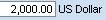
Amount
For display only fields the recommended UI element is a TextView, for editable fields you should use an InputField.
The InputField is by default rendered in
● an InputField that displays the amount and another one that displays the currency code.
Formatting Options
You can specify the currencyPresentationMode property of the InputField’s valueproperty:
value |
description |
visual display |
code |
(default) |
|
displayOnlyCode |
The unit is displayed as TextView and as code. |
|
displayOnlyDescription |
The unit is displayed as TextView with full description |
|
none |
The unit is not displayed |
|


Code
Formatting Options
● presentationMode:
○ Code
○ Description
○ Both:

○ CodeAndDisplayOnlyDescription:

● ValueHelpSortOrder:
○ Unsorted: Original order, as provided by the value help provider
○ AscendingCode: Value help is sorted by the code
○ AscendingDescription: Value help is sorted by the description
○ Standard (default): Sorting behavior depends on presentationMode. That is, if the presentationMode is code (or both), the list is sorted alphabetically by code. If the presentationMode is description, the list is sorted alphabetically by description.
Suggest Values
For all fields of data type Code the values are suggested automatically if implemented in the ESR (Enterprise Service Repository).
Date
For
display only fields the recommended UI element is a TextView, for editable fields you should use an InputField. The InputField is
rendered with a DatePicker und looks like:  . The value is displayed according to the
language/country specific formats.
. The value is displayed according to the
language/country specific formats.
Formatting Options
You can specify the format property of the InputField’s valueproperty:
● numeric.
● usingNames. This option is only supported for display only fields, the value is displayed such as: Thursday, January 1, 1970.
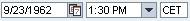
DateTime
For display only fields the recommended UI element is a TextView, for editable fields you should use an InputField.
The InputField is rendered into
● an InputField that displays the date with DatePicker,
● a ComboBox that displays the time
● an InputField displaying the time zone.
The
value is displayed according to the language/country specific formats. The
visual display looks like: 
DateTime is not intended for direct use, there are different specializations:
● DateTimeGlobal.
● DateTimeIndependent
● DateTimeLocal
● DateTimeLocalNormalized
Formatting Options
You can specify the following formatting options for a DateTime:
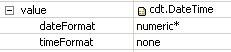
● dateFormat
○ numeric.
○ usingNames. This option is only supported for display only fields, the value is displayed such as: Thursday, January 1, 1970.
● timeFormat
○ hoursAndMinutes:
○ hoursMinutesAndSeconds

○ none: There is no time and no time zone displayed.
● timeZonePresentationMode:
○ None
○ Code: for example, “Europe/Berlin”
○ Description: for example, “Central European Time”
Description
For display only fields the recommended UI element is a TextView, for editable fields you should use a TextEdit. Language code has to be bound explicitly.
If the markupLanguageCode for a description is set and the value is set to XHTML, the TextEdit will be rendered into a FormattedTextEdit and the TextView is rendered into a FormattedTextView, so that the description can be displayed according the given formats.
Duration
For display only fields the recommended UI element is a TextView, for editable fields you should use an InputField.
Duration is provided in three differentiations:
· full Duration
For each unit, a value is set, the value and the unit are displayed. The user can enter data using abbreviations, e. g. : 2 y 3 m 1 d 20 h 34 m 45 s.
This results in the following output: 
2 Year(s) 3 Month(s) 1 Day(s) 20 Hour(s) 34 Minute(s) 45 Second(s).
Formatting Options
You can specify the smallestVisibleUnit for a Duration:
○ years
○ months
○ days
○ hours
○ minutes
○ seconds (default)
· Duration time
A duration that is restricted to display hours, minutes and seconds.
· Duration single unit
This duration is used to
display single units, e. g.:  The given value is displayed in an
InputField and the unit in a
TextView beneath.
The given value is displayed in an
InputField and the unit in a
TextView beneath.
Identifier
For
display only fields the recommended UI element is a TextView, for editable fields you should use an InputField. As value help OVS is provided. 
Indicator
For display only fields the recommended UI element is a TextView, for editable fields you should use an CheckBox.
Measure
For display only fields the recommended UI element is a TextView, for editable fields you should use an InputField.
The InputField is rendered in two InputFields: one displays the numeric value and the other the unit of measurement.
Formatting Options
You can specify the unitPresentationMode property of the InputField’s valueproperty:
value |
description |
visual display |
code |
(default): The unit is displayed in an input field. |
|
displayOnlyCode |
The unit is displayed as TextView and as code. |
|
displayOnlyDescription |
The unit is displayed as TextView and in full description |
|
none |
The unit is not displayed |
|


Name
For display only fields the recommended UI element is a TextView, for editable fields you should use an InputField.
Note
For display only fields the recommended UI element is a TextView, for editable fields you should use a TextEdit. Language code has to be bound explicitly.
If the markupLanguageCode for a description is set and the value is set to XHTML, the TextEdit will be rendered into a FormattedTextEdit and the TextView is rendered into a FormattedTextView, so that the description can be displayed according the given formats.
Numeric
For
display only fields the recommended UI element is a TextView, for editable fields you should use an InputField. 
Percent
For
display only fields the recommended UI element is a TextView, for editable fields you should use an InputField. The visual display looks like: 
Quantity
For display only fields the recommended UI element is a TextView, for editable fields you should use an InputField.
The InputField is rendered in
● two InputFields: one displays the numeric value and the other the unit.
The
visual display of a Quantity with unitPresentationMode is code looks like: 
Formatting Options
You can specify the unitPresentationMode property of the InputField’s valueproperty:
● code (default)
● displayOnlyCode: The unit is displayed as TextView.
● displayOnlyDescription: The unit is not displayed.
● none: The unit is not displayed
Ratio/Rate
For display only fields the recommended UI element is a TextView, for editable fields you should use an InputField.
Text
For display only fields the recommended UI element is a TextView, for editable fields you should use a TextEdit. Language code has to be bound explicitly.
If the markupLanguageCode for a text is set and the value is set to XHTML, the TextEdit will be rendered into a FormattedTextEdit and the TextView into aFormattedTextView, so that the description can be displayed according the given formats.

Time
For
display only fields the recommended UI element is a TextView, for editable fields you should use an InputField. The InputField is rendered into a ComboBox. 
Formatting Options
You can specify the format property of the InputField’s valueproperty:
● hoursAndMinutes (default)
●
hoursMinutesAndSeconds 
URI
URI can be used to represent data for email addresses, websites, and documents or information provided on websites. For display only fields the recommended UI element is a TextView or a LinkToURL, for editable fields you should use an InputField.

Value
For
display only fields the recommended UI element is a TextView, for editable fields you should use an InputField.
Procedure
Sel...
1.
Select
the relevant InputField, switch to the Properties view, select the value property and select
the bind button  on the right hand side.
2. Select the desired context attribute, e. g. Amount, and confirm with OK.
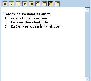
3. To set the desired formatting options, open the value property by clicking on the little cross: For a DateTime bound InputField you see the options displayed as in the screenshot below:
More information
For a complete list of all supported units of measurement, for the type Amount, Measure, and Quantity: