
 Designing a View Layout
Prerequisites
You are in the SAP NetWeaver Developer Studio and have created empty views.
Procedure
Use of MIME Objects
The following images are used in the quiz application. Save them locally in the directory src/mimes/Components/com.sap.tc.webdynpro.tutorials.quiz.Quiz.
File Name |
Image |
File Name |
Image |
a.jpg |
|
q.jpg |
|
questionmark.jpg |
|
question.jpg |
|
answer.jpg |
|
exit.jpg |
|
start. jpg |
|
end.jpg |
|


You now create the appropriate UI elements for the empty views.
1. Double-click the view in the Web Dynpro Explorer to start editing in the View Designer and select the Layout tab. You see a hierarchical overview of all UI elements of the view in the Outline area. The top node of this structure is always RootUIElementContainer.

UI elements are always embedded in a superordinate container UI element (for example, the transparent container or a group).
2. You create the UI elements in the Outline area. In this area, choose Insert Child in the context menu of the superordinate UI element into which you want to insert the new UI element.
3. You can edit the properties of the selected UI element in the View Designer using the Properties tab.
The following overview lists the UI elements that should be defined for the views of this Web Dynpro application.
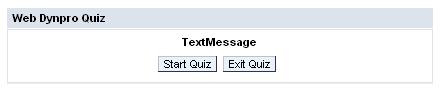
Welcome View
Insert the UI elements of the table into the Welcome view. Create the UI elements according to their order in the table. You can delete the existing UI element DefaultTextView provided by default.
View Layout in the View Designer of the Web Dynpro Tools |
|
|
|
Property |
Value |
Group WelcomeViewGroup of type Group in the UI element RootUIElementContainer |
|
Properties of Group ® design |
sapcolor |
Properties of Group ® layout |
GridLayout |
Properties of Group ® width |
100% |
Layout ® colCount |
2 |
Caption WelcomeViewGroup_Header
of type Caption in the UI element
WelcomeViewGroup |
|
Properties of Caption ® text |
Web Dynpro Quiz |
Text TextMessage of type TextView in the UI element WelcomeViewGroup |
|
Properties of TextView ® design |
emphasized |
Properties of TextView ® text |
Welcome Text |
LayoutData ® colSpan |
2 |
LayoutData ® hAlign |
center |
LayoutData ® paddingBottom |
medium |
Pushbutton StartQuizButton of the type Button in the UI element WelcomeViewGroup |
|
Properties of Button ® text |
Start Quiz |
Properties of Button ® imageSource |
start.jpg |
LayoutData ® hAlign |
right |
LayoutData ® paddingRight |
small |
LayoutData ® width |
50% |
Pushbutton ExitButton of type Button in the UI element WelcomeViewGroup |
|
Properties of Button ® text |
Exit Quiz |
Properties of Button ® imageSource |
exit.jpg |
LayoutData ® width |
50% |

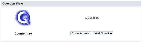
Question View
Insert the following UI elements into the Question view (delete DefaultTextView):
View Layout in the View Designer of the Web Dynpro Tools |
|
|
|
Property |
Value |
Group QuestionViewGroup of type Group in the UI element RootUIElementContainer |
|
Properties of Group ® design |
sapcolor |
Properties of Group ® layout |
GridLayout |
Properties of Group ® width |
100% |
Layout ® colCount |
2 |
Caption QuestionViewGroup_header of type Caption in the UI element QuestionViewGroup |
|
Properties of Caption ® text |
Question View |
Image QImage of the type Image in the UI element QuestionViewGroup |
|
Properties of Image ® source |
q.jpg |
Properties of Image ® tooltip |
Question |
LayoutData ® hAlign |
center |
LayoutData ® paddingTop |
large |
Text QuestionText of type TextView in the UI element QuestionViewGroup |
|
Properties of TextView ® design |
header4 |
Properties of TextView ® text |
A Question |
Properties of TextView ® wrapping |
true |
LayoutData ® hAlign |
center |
LayoutData ® vAlign |
middle |
Text QuestionCounter of type TextView in the UI element QuestionViewGroup |
|
Properties of TextView ® design |
header2 |
Properties of TextView ® text |
Counter Info |
LayoutData ® paddingTop |
large |
LayoutData ® paddingBottom |
large |
Container TransparentButtonContainer of the type TransparentContainer in the UI element QuestionViewGroup |
|
LayoutData ® hAlign |
center |
Pushbutton ShowAnswerButton of the type Button in the UI element TransparentButtonContainer |
|
Properties of Button ® text |
Show Answer |
Properties of Button ® imageSource |
answer.jpg |
Pushbutton NextQuestionButton of the type Button in the UI element TransparentButtonContainer |
|
Properties of Button ® text |
Next Question |
Properties of Button ® imageSource |
question.jpg |
LayoutData ® paddingLeft |
medium |
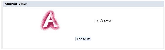
Answer View
Insert the following UI elements into the Answer view (delete DefaultTextView):
View Layout in the View Designer of the Web Dynpro Tools |
|
|
|
Property |
Value |
Container RootUIElementContainer of
type TransparentContainer |
|
Properties ® layout |
GridLayout |
Group AnswerViewGroup of type Group in the UI element RootUIElementContainer |
|
Properties of Group ® design |
sapcolor |
Properties of Group ® layout |
GridLayout |
Properties of Group ® width |
100% |
Layout ® colCount |
2 |
LayoutData ® paddingLeft |
medium |
Caption AnswerViewGroup _header of type Caption in the UI element AnswerViewGroup |
|
Properties of Caption ® text |
Answer View |
Image AImage of type Image in the UI element AnswerViewGroup |
|
Properties of Image ® source |
a.jpg |
Properties of Image ® tooltip |
Answer |
LayoutData ® hAlign |
center |
LayoutData ® paddingTop |
large |
Text AnswerText of type TextView in the UI element AnswerViewGroup |
|
Properties of TextView ® design |
header4 |
Properties of TextView ® text |
An Answer |
Properties of TextView ® wrapping |
true |
LayoutData ® hAlign |
center |
LayoutData ® vAlign |
middle |
Pushbutton EndQuizButton of the type Button in the UI element AnswerViewGroup |
|
Properties of Button ® text |
End Quiz |
Properties of Button ® imageSource |
end.jpg |
LayoutData ® colSpan |
2 |
LayoutData ® hAlign |
center |
LayoutData ® paddingBotton |
large |
LayoutData ® paddingTop |
large |
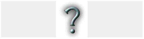
QuestionMark View
Insert the following UI elements into the QuestionMark view:
View Layout in the View Designer of the Web Dynpro Tools |
|
|
|
Property |
Value |
Container RootUIElementContainer of the type TransparentContainer |
|
Properties ® layout |
GridLayout |
LayoutData ® colCount |
1 |
Image QuestionMarkImage of type Image in the UI element RootUIElementContainer |
|
Properties ® source |
questionmark.jpg |
Properties ® tooltip |
question mark |
LayoutData ® hAlign |
center |
LayoutData ® vAlign |
middle |
 Now create the pushbuttons by
using the
ActionButton template.
Now create the pushbuttons by
using the
ActionButton template.