TextView Properties
Expand the properties to display further details.
design
Appearance of the TextView UI element. The portal themes delivered by SAP describe how the various options of the design attribute can be displayed. This property can be personalized by administrators.
|
Value |
Visualization |
Description |
|---|---|---|
|
emphasized |
|
Text is highlighted and the font size is standard. |
|
groupTitle |
|
Title of forms If accessibility mode is activated, with TextView.design=groupTitle the TextView is not included in the tab chain, and must be repeated in the surrounding container. This is because a ScrollContainer or TransparentContainer with scrollingMode=none (TransparentContainer) has been used to group together form elements. The title should then be read by a screen reader when the user navigates to the container. For this reason the accessibilityDescription text of the ScrollContainer or TransparentContainer must be inserted. To prevent the text from being read twice, the tab chain does not contain the TextView with design=groupTitle. |
|
header1 |
|
Text is highlighted and the size of the font is +4 relation to the standard size. |
|
header2 |
|
Text is highlighted with font size +5.08 cm relation to the default font size. |
|
header3 |
|
Text is highlighted and the font size is standard. |
|
header4 |
|
Text is highlighted and the font size -1 in relation to the standard size (same as for legend, but highlighted) |
|
label |
|
Text is displayed in the standard font. An extra space is always added at the end of the text. |
|
label_small |
|
Text is displayed in the standard font; as with label, but font size is -1 (same as font size of header4) |
|
legend |
|
Text is displayed in the standard font and the font size -1. |
|
reference |
|
Text is displayed in italics and has the standard font size. |
|
standard |
|
The text is displayed in the standard font size. No text attributes are defined for this value. |
|
monospace |
|
Text is displayed in non-proportional font type. Each letter takes up the same space. |


hAlign
Horizontal alignment of the content within the Textview UI element. For the positioning of the text we recommend that you set the hAlign value for the LayoutData of the UI element and TableColumn.hAlign, and that you do not use TextView.hAlign. However, if you do use TextView.hAlign, you must set TextView.layout=block, and define a suitable width. This property can be personalized by administrators.
|
Value |
Description |
|---|---|
|
auto |
Automatic alignment of the text content. The alignment is defined by the data type of the value to be displayed. |
|
center |
Centered alignment |
|
forcedLeft |
The text content is always left-justified, regardless of whether the textDirection property uses value ltr or rtl. |
|
endOfLine |
The text is always displayed at the end of the line. Therefore, if the textDirection property is set to ltr, the text content is right-justified. The text content for value rtl is left-justified. |
|
forcedRight |
The text content is always right-justified, regardless of whether the textDirection property is set to ltr or rtl. |
|
beginOfLine |
The text is always displayed at the beginning of the line. Therefore, if the textDirection property is set to ltr, the text content is left-justified. The text content for value rtl is right-justified. |
layout
Layout of the text in the TextView. This property can be personalized by administrators.
|
Value |
Description |
Can be Set Using Personalization |
|---|---|---|
|
Block |
Displays the TextView UI element in a <div> tag. See also the hAlign property. |
Yes |
|
native |
Standard display Displays the TextView UI element in a <span> tag. |
Yes |
|
paragraph |
Displays the TextView UI element in a <p> tag. |
Yes |
menuIndicator
If you set a value for this property, it only has an effect if a visible menu is assigned to the TextView (described below).
|
Value |
Visualization |
Description |
|---|---|---|
|
iconPermanent |
|
Returns a menu symbol after the TextView. The menu opens if the symbol is clicked on. |
|
triangleOnHover |
|
Standard display Returns a small triangle after the TextView, which appears when you hover the mouse over the TextView. The text color will change too. The menu opens if you click on the TextView or the triangle. |
|
trianglePermanent |
|
Returns a small triangle after the TextView, which is permanently visible. If you hover the mouse over the TextView, the color of the text and triangle changes. The menu opens if you click on the TextView or the triangle. |

semanticColor
Semantic color With regard to accessibility make sure that the color description, "e.g. negative value", is automatically included in the tooltip. From the perspective of accessibility, colors must be used in accordance with their semantic meaning. This property can be personalized by administrators.
|
Value |
Visualization |
Description |
|---|---|---|
|
standard |
|
Standard display |
|
diminished |
|
Greyed-out display |
|
positive |
|
Display as positive |
|
critical |
|
Display as critical |
|
negative |
|
Display as negative |
|
marked1 |
|
First level selection |
|
marked2 |
|
Second level selection |


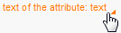
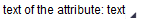
text
Label text Each occurrence of cl_abap_char_utilities=>newline in this property is replaced with a line break in the browser display. For more information, see Primary Property. This property can be personalized by administrators.
width
Width of the UI element; see also Methods and Properties of UI Elements. Width specification:
-
wrapping=true
If necessary the text is wrapped. The width cannot be guaranteed.
-
wrapping=false
The width of the text is precisely as specified. If necessary, the text output is cut short with "...".
wrapping
Specifies whether the text can be wrapped to the next line, if the space specified for the surrounding layout is no longer sufficient. Otherwise, the TextView becomes as wide as the space the text within it requires, and the surrounding layout is widened accordingly. This property can be personalized by administrators.