hana_ml.visualizers package
The Visualizers Package consists of the following sections:
hana_ml.visualizers.eda
This module represents an eda plotter. Matplotlib is used for all visualizations.
- hana_ml.visualizers.eda.quarter_plot(data, col, key=None, ax=None, fig=None, enable_plotly=True, **kwargs)
-
Perform quarter plot to view the seasonality.
- Parameters:
-
- dataDataFrame
-
HANA DataFrame containing the data.
- colstr
-
Name of the time series data column.
- keystr, optional
-
Name of the ID column.
Defaults to the index column of
data(i.e. data.index) if it is set. - axmatplotlib.axes.Axes, optional
-
The axes for the plot.
Default to None.
- enable_plotlybool, optional
-
Use plotly instead of matplotlib.
Defaults to True.
- figplotly.graph_objects.Figure, optional
-
If None, a new graph object will be created. Valid when
enable_plotlyis True.Defaults to None.
- kwargsoptional
-
Keyword/value pair of properties to be updated when
enable_plotlyis True.Defaults to None.
- Returns:
-
- matplotlib:
-
If
enable_plotlyis False, returns a matplotlib.axes.Axes object. - plotly:
-
If
enable_plotlyis True, returns a plotly.graph_objects.Figure object.
Examples
Matplotlib:
>>> quarter_plot(data=df, col="Y", key="ID", enable_plotly=False)

Plotly:
>>> quarter_plot(data=df, col="Y", key="ID", width=600, height=400)

- hana_ml.visualizers.eda.seasonal_plot(data, col, key=None, ax=None, enable_plotly=True, fig=None, **kwargs)
-
Plot time series data by year.
- Parameters:
-
- dataDataFrame
-
HANA DataFrame containing the data.
- colstr
-
Name of the time series data column.
- keystr, optional
-
Name of the ID column.
Defaults to the index column of
data(i.e. data.index) if it is set. - axmatplotlib.axes.Axes, optional
-
The axes for the plot.
Default to None.
- enable_plotlybool, optional
-
Use plotly instead of matplotlib.
Defaults to True.
- figplotly.graph_objects.Figure, optional
-
If None, a new graph object will be created. Valid when
enable_plotlyis True.Defaults to None.
- kwargsoptional
-
Keyword/value pair of properties to be updated when
enable_plotlyis True.Defaults to None.
- Returns:
-
- matplotlib:
-
The axes for the plot, returns a matplotlib.axes.Axes object.
- plotly:
-
If
enable_plotlyis True, returns a plotly.graph_objects.Figure object.
Examples
Matplotlib:
>>> seasonal_plot(data=df, col="Y", key="ID", enable_plotly=False)

Plotly:
>>> seasonal_plot(data=df, col="Y", key="ID")

- hana_ml.visualizers.eda.timeseries_box_plot(data, col, key=None, ax=None, cycle='MONTH', fig=None, enable_plotly=True, **kwargs)
-
Plot year-wise/month-wise box plot.
- Parameters:
-
- dataDataFrame
-
HANA DataFrame containing the data.
- colstr
-
Name of the time series data column.
- keystr, optional
-
Name of the ID column.
Defaults to the index column of
data(i.e. data.index) if it is set. - axmatplotlib.axes.Axes, optional
-
The axes for the plot.
Default to None.
- cycle{"YEAR", "QUARTER", "MONTH", "WEEK"}, optional
-
It defines the x-axis for the box plot.
Defaults to "MONTH".
- enable_plotlybool, optional
-
Use plotly instead of matplotlib.
Defaults to True.
- figplotly.graph_objects.Figure, optional
-
If None, a new graph object will be created. Valid when
enable_plotlyis True.Defaults to None.
- kwargsoptional
-
Keyword/value pair of properties to be updated when
enable_plotlyis True.Defaults to None.
- Returns:
-
- matplotlib:
-
The axes for the plot, returns a matplotlib.axes.Axes object.
- plotly:
-
If
enable_plotlyis True, returns a plotly.graph_objects.Figure object.
Examples
Example 1: cycle = 'YEAR'
Matplotlib:
>>> timeseries_box_plot(data=df, col="Y", key="ID", cycle="YEAR", enable_plotly=False)

Plotly:
>>> timeseries_box_plot(data=df, col="Y", key="ID", cycle="YEAR")

Example 2: cycle = 'QUARTER'
Matplotlib:
>>> timeseries_box_plot(data=df, col="Y", key="ID", cycle="QUARTER", enable_plotly=False)

Plotly:
>>> timeseries_box_plot(data=df, col="Y", key="ID", cycle="QUARTER")

Example 3: cycle = 'MONTH'
Matplotlib:
>>> timeseries_box_plot(data=df, col="Y", key="ID", cycle="MONTH", enable_plotly=False)

Plotly:
>>> timeseries_box_plot(data=df, col="Y", key="ID", cycle="MONTH")

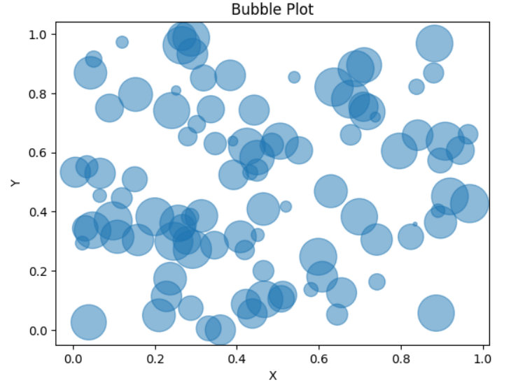
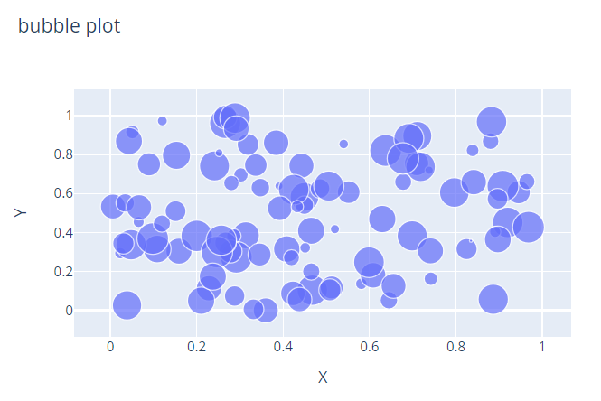
- hana_ml.visualizers.eda.bubble_plot(data, x, y, size, color=None, alpha=None, title=None, ax=None, enable_plotly=True, **kwargs)
-
A bubble plot is a type of chart that displays data points as bubbles (or circles) in a two-dimensional space. Similar to a scatter plot, a bubble plot uses the x and y coordinates to represent the variables of interest. A third dimension of the data is shown through the size of bubbles.
- Parameters:
-
- dataDataFrame
-
Input HANA dataframe.
- xstr
-
Column name containing x coordinate.
- ystr
-
Column name contraining y coordinate.
- sizestr
-
Column name containing the size of bubbles.
- colora list of str, optional
-
The marker colors.
Defaults to None.
- alphafloat, optional
-
The alpha blending value, between 0 (transparent) and 1 (opaque).
Only valid when matplotlib is used.
Defaults to None.
- axAxes, optional
-
The axes for the plot.
- enable_plotlybool, optional
-
Use plotly instead of matplotlib.
Defaults to True.
- kwargsoptional
-
Keyword/value pair of properties to be updated when
enable_plotlyis True.Defaults to None.
- Returns:
-
- matplotlib:
-
The axes for the plot.
- plotly:
-
If
enable_plotlyis True, returns a plotly.graph_objects.Figure object.
Examples
Matplotlib:
>>> bubble_plot(data=df, x='X', y='Y', size='S', alpha=0.5, title="Bubble Plot", enable_plotly=False)
Plotly:
>>> bubble_plot(data=df, x='X', y='Y', size='S', width=600, height=400)
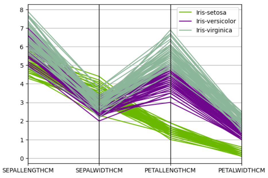
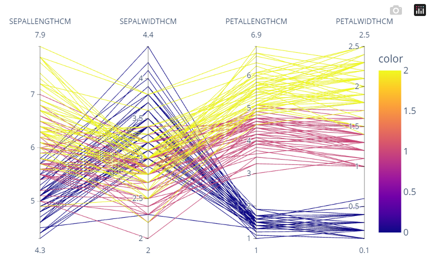
- hana_ml.visualizers.eda.parallel_coordinates(data, label, cols=None, color=None, axvlines=None, sort_labels=None, ax=None, enable_plotly=True, **kwargs)
-
A parallel coordinates plot is a visualization technique used to display and analyze multivariate data. Currently, this function supports the dataset that have multiple numberical variables. In a parallel coordinates plot, each variable is represented by a vertical axis, and lines are drawn to connect the points representing each data observation across these axes. Each line represents an individual data point in the dataset. The position of the line on each axis corresponds to the value of the corresponding variable.
- Parameters:
-
- dataDataFrame
-
Input HANA dataframe.
- labelstr
-
Column name containing class names.
- colsstr or a list of str, optional
-
A list of column names to use. If the value is not provided, all columns in the data except for label column will be used.
Default to None.
- colorlist or tuple (matplotlib) or str or int or Series or array-like(plotly), optional
-
Colors to use for the different classes.
Defaults to None.
- axvlinesbool, optional
-
If true, vertical lines will be added at each xtick.
Only valid when matplotlib is used.
Defaults to None.
- sort_labelsbool, optional
-
Sort classes in label column, useful when assigning colors.
Only valid when matplotlib is used.
Defaults to None.
- axAxes, optional
-
The axes for the plot.
- enable_plotlybool, optional
-
Use plotly instead of matplotlib.
Defaults to True.
- kwargsoptional
-
Keyword/value pair of properties to be updated when
enable_plotlyis True.Defaults to None.
- Returns:
-
- matplotlib:
-
The axes for the plot.
- plotly:
-
If
enable_plotlyis True, returns a plotly.graph_objects.Figure object.
Examples
Matplotlib:
>>> parallel_coordinates(data=df, label='SPECIES',
                         cols=['SEPALLENGTHCM', 'SEPALWIDTHCM', 'PETALLENGTHCM', 'PETALWIDTHCM'],
                         axvlines=True, sort_labels=True, enable_plotly=False)
Plotly:
>>> parallel_coordinates(data=df, label='SPECIES',
                         cols=['SEPALLENGTHCM', 'SEPALWIDTHCM', 'PETALLENGTHCM', 'PETALWIDTHCM'],
                         width=600, height=400)
- hana_ml.visualizers.eda.plot_acf(data, col, key=None, thread_ratio=None, method=None, max_lag=None, calculate_confint=True, alpha=None, bartlett=None, ax=None, title=None, enable_plotly=True, fig=None, **kwargs)
-
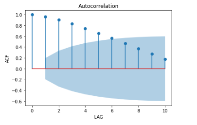
Autocorrelation function plot (ACF).
- Parameters:
-
- dataDataFrame
-
HANA DataFrame containing the data.
- colstr
-
Name of the time series column.
- keystr, optional
-
Name of the ID column.
Defaults to the index column of
data(i.e. data.index) if it is set. - thread_ratiofloat, optional
-
The ratio of available threads.
-
0: single thread
-
0~1: percentage
-
Others: heuristically determined
Valid only when
methodis set as 'brute_force'.Defaults to -1.
-
- method{'auto', 'brute_force', 'fft'}, optional
-
Indicates the method to be used to calculate the correlation function.
Defaults to 'auto'.
- max_lagint, optional
-
Maximum lag for the correlation function.
Defaults to sqrt(n), where n is the data number.
- calculate_confintbool, optional
-
Controls whether to calculate confidence intervals or not.
If it is True, two additional columns of confidence intervals are shown in the result.
Defaults to True.
- alphafloat, optional
-
Confidence bound for the given level are returned. For instance if alpha=0.05, 95 % confidence bound is returned.
Valid only when only
calculate_confintis True.Defaults to 0.05.
- bartlettbool, optional
-
-
False: using standard error to calculate the confidence bound.
-
True: using Bartlett's formula to calculate confidence bound.
Valid only when only
calculate_confintis True.Defaults to True.
-
- axmatplotlib.axes.Axes, optional
-
The axes for the plot.
Default to None.
- titlestr, optional
-
The title of plot.
Defaults to "Autocorrelation".
- enable_plotlybool, optional
-
Use plotly instead of matplotlib.
Defaults to True.
- figplotly.graph_objects.Figure, optional
-
If None, a new graph object will be created. Valid when
enable_plotlyis True.Defaults to None.
- kwargsoptional
-
Keyword/value pair of properties to be updated when
enable_plotlyis True.Defaults to None.
- Returns:
-
- matplotlib:
-
The axes for the plot, returns a matplotlib.axes.Axes object.
- plotly:
-
If
enable_plotlyis True, returns a plotly.graph_objects.Figure object.
Examples
Matplotlib:
>>> plot_acf(data=df, key='ID', col='ts', method='fft', enable_plotly=False)
Plotly:
>>> plot_acf(data=df, key='ID', col='ts', method='fft', width=600, height=400)

- hana_ml.visualizers.eda.plot_pacf(data, col, key=None, thread_ratio=None, method=None, max_lag=None, calculate_confint=True, alpha=None, bartlett=None, ax=None, title=None, enable_plotly=True, fig=None, **kwargs)
-
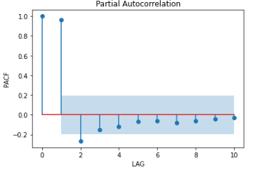
Plot partial autocorrelation function (PACF).
- Parameters:
-
- dataDataFrame
-
HANA DataFrame containing the data.
- colstr, optional
-
Name of the time series data column.
- keystr, optional
-
Name of the ID column.
Defaults to the index column of
data(i.e. data.index) if it is set. - thread_ratiofloat, optional
-
The ratio of available threads.
-
0: single thread
-
0~1: percentage
-
Others: heuristically determined
Valid only when
methodis set as 'brute_force'.Defaults to -1.
-
- method{'auto', 'brute_force', 'fft'}, optional
-
Indicates the method to be used to calculate the correlation function.
Defaults to 'auto'.
- max_lagint, optional
-
Maximum lag for the correlation function.
Defaults to sqrt(n), where n is the data number.
- calculate_confintbool, optional
-
Controls whether to calculate confidence intervals or not.
If it is True, two additional columns of confidence intervals are shown in the result.
Defaults to True.
- alphafloat, optional
-
Confidence bound for the given level are returned. For instance if alpha=0.05, 95 % confidence bound is returned.
Valid only when only
calculate_confintis True.Defaults to 0.05.
- bartlettbool, optional
-
-
False: using standard error to calculate the confidence bound.
-
True: using Bartlett's formula to calculate confidence bound.
Valid only when only
calculate_confintis True.Defaults to True.
-
- axmatplotlib.axes.Axes, optional
-
The axes for the plot.
Default to None.
- titlestr, optional
-
The title of plot.
Defaults to "Partial Autocorrelation".
- enable_plotlybool, optional
-
Use plotly instead of matplotlib.
Defaults to True.
- figplotly.graph_objects.Figure, optional
-
If None, a new graph object will be created. Valid when
enable_plotlyis True.Defaults to None.
- kwargsoptional
-
Keyword/value pair of properties to be updated when
enable_plotlyis True.Defaults to None.
- Returns:
-
- matplotlib:
-
The axes for the plot, returns a matplotlib.axes.Axes object.
- plotly:
-
If
enable_plotlyis True, returns a plotly.graph_objects.Figure object.
Examples
Matplotlib:
>>> plot_pacf(data=df, key='ID', col='ts', method='fft', enable_plotly=False)
Plotly:
>>> plot_pacf(data=df, key='ID', col='ts', method='fft', width=600, height=400)

- hana_ml.visualizers.eda.plot_time_series_outlier(data, col, key=None, tso_object=None, window_size=None, outlier_method=None, threshold=None, detect_seasonality=None, alpha=None, extrapolation=None, periods=None, random_state=None, n_estimators=None, max_samples=None, bootstrap=None, contamination=None, minpts=None, eps=None, thread_ratio=None, title=None, ax=None, enable_plotly=True, fig=None, **kwargs)
-
Perform OutlierDetectionTS and plot the time series with the highlighted outliers.
- Parameters:
-
- dataDataFrame
-
HANA DataFrame containing the data.
datashould have at least two columns: one is ID column, the other is raw data. - colstr
-
Column name of endog.
- keystr, optional
-
Name of the ID column.
Defaults to the index column of
data(i.e. data.index) if it is set. - tso_objectOutlierDetectionTS object, optional
-
An object of OutlierDetectionTS for time series outlier. Please initialize a OutlierDetectionTS object first. You could either enter a OutlierDetectionTS object or set values of parameters to create a new OutlierDetectionTS object in this function.
Defaults to None.
- window_sizeint, optional
-
Odd number, the window size for median filter, not less than 3.
Defaults to 3.
- outlier_methodstr, optional
-
The method for calculate the outlier score from residual.
-
'z1' : Z1 score.
-
'z2' : Z2 score.
-
'iqr' : IQR score.
-
'mad' : MAD score.
-
'isolationforest' : isolation forest score.
-
'dbscan' : DBSCAN.
Defaults to 'z1'.
-
- thresholdfloat, optional
-
The threshold for outlier score. If the absolute value of outlier score is beyond the threshold, we consider the corresponding data point as an outlier.
Only valid when
outlier_method= 'iqr', 'isolationforest', 'mad', 'z1', 'z2'. Foroutlier_method= 'isolationforest', whencontaminationis provided,thresholdis not valid and outliers are decided bycontamination.Defaults to 3 when
outlier_methodis 'mad', 'z1' and 'z2'. Defaults to 1.5 whenoutlier_methodis 'iqr'. Defaults to 0.7 whenoutlier_methodis 'isolationforest'. - detect_seasonalitybool, optional
-
When calculating the residual,
-
False: Does not consider the seasonal decomposition.
-
True: Considers the seasonal decomposition.
Defaults to False.
-
- alphafloat, optional
-
The criterion for the autocorrelation coefficient. The value range is (0, 1).
A larger value indicates a stricter requirement for seasonality.
Only valid when
detect_seasonalityis True.Defaults to 0.2.
- extrapolationbool, optional
-
Specifies whether to extrapolate the endpoints. Set to True when there is an end-point issue.
Only valid when
detect_seasonalityis True.Defaults to False.
- periodsint, optional
-
When this parameter is not specified, the algorithm will search the seasonal period. When this parameter is specified between 2 and half of the series length, autocorrelation value is calculated for this number of periods and the result is compared to
alphaparameter. If correlation value is equal to or higher thanalpha, decomposition is executed with the value ofperiods. Otherwise, the residual is calculated without decomposition. For other value of parameterperiods, the residual is also calculated without decomposition.Only valid when
detect_seasonalityis True. If the user knows the seasonal period, specifyingperiodscan speed up the calculation, especially when the time series is long.No Default value.
- random_stateint, optional
-
Specifies the seed for random number generator.
-
0: Uses the current time (in second) as seed.
-
Others: Uses the specified value as seed.
Only valid when
outlier_methodis 'isolationforest'.Default to 0.
-
- n_estimatorsint, optional
-
Specifies the number of trees to grow.
Only valid when
outlier_methodis 'isolationforest'.Default to 100.
- max_samplesint, optional
-
Specifies the number of samples to draw from input to train each tree. If
max_samplesis larger than the number of samples provided, all samples will be used for all trees.Only valid when
outlier_methodis 'isolationforest'.Default to 256.
- bootstrapbool, optional
-
Specifies sampling method.
-
False: Sampling without replacement.
-
True: Sampling with replacement.
Only valid when
outlier_methodis 'isolationforest'.Default to False.
-
- contaminationdouble, optional
-
The proportion of outliers in the data set. Should be in the range (0, 0.5].
Only valid when
outlier_methodis 'isolationforest'. Whenoutlier_methodis 'isolationforest' andcontaminationis specified,thresholdis not valid.No Default value.
- minptsint, optional
-
Specifies the minimum number of points required to form a cluster. The point itself is not included in
minpts.Only valid when
outlier_methodis 'dbscan'.Defaults to 1.
- epsfloat, optional
-
Specifies the scan radius.
Only valid when
outlier_methodis 'dbscan'.Defaults to 0.5.
- thread_ratiofloat, optional
-
The ratio of available threads.
-
0: single thread.
-
0~1: percentage.
-
Others: heuristically determined.
Only valid when
detect_seasonalityis True oroutlier_methodis 'isolationforest' or 'dbscan'.Defaults to -1.
-
- titlestr, optional
-
The title of plot.
Defaults to "Outliers".
- axmatplotlib.axes.Axes, optional
-
The axes for the plot.
Default to None.
- enable_plotlybool, optional
-
Use plotly instead of matplotlib.
Defaults to True.
- figplotly.graph_objects.Figure, optional
-
If None, a new graph object will be created. Valid when
enable_plotlyis True.Defaults to None.
- kwargsoptional
-
Keyword/value pair of properties to be updated when
enable_plotlyis True.Defaults to None.
- Returns:
-
- matplotlib:
-
The axes for the plot, returns a matplotlib.axes.Axes object.
- plotly:
-
If
enable_plotlyis True, returns a plotly.graph_objects.Figure object.
Examples
Matplotlib:
>>> plot_time_series_outlier(data=df, key='ID', col='ts', enable_plotly=False)

Plotly:
>>> plot_time_series_outlier(data=df, key='ID', col='ts', width=600, height=400)

- hana_ml.visualizers.eda.plot_change_points(data, cp_object, col, key=None, display_trend=True, cp_style='axvline', title=None, ax=None, enable_plotly=True, fig=None, **kwargs)
-
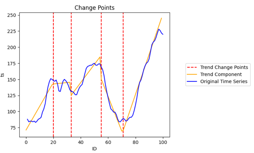
Plot the time series with the highlighted change points and BCPD is used for change point detection.
- Parameters:
-
- dataDataFrame
-
HANA DataFrame containing the data.
datashould have at least two columns: one is ID column, the other is raw data. - colstr
-
Name of the time series data column.
- cp_objectBCPD object
-
An object of BCPD for change points detection. Please initialize a BCPD object first.
An example is shown below:
- keystr, optional
-
Name of the ID column.
Defaults to the index column of
data(i.e. data.index) if it is set. - cp_style{"axvline", "scatter"}, optional
-
The style of change points in the plot.
Defaults to "axvline".
- display_trendbool, optional
-
If True, draw the trend component based on decomposed component of trend of BCPD fit_predict().
Default to True.
- titlestr, optional
-
The title of plot.
Defaults to "Change Points".
- axmatplotlib.axes.Axes, optional
-
The axes for the plot.
Default to None.
- enable_plotlybool, optional
-
Use plotly instead of matplotlib.
Defaults to True.
- figplotly.graph_objects.Figure, optional
-
If None, a new graph object will be created. Valid when
enable_plotlyis True.Defaults to None.
- kwargsoptional
-
Keyword/value pair of properties to be updated when
enable_plotlyis True.Defaults to None.
- Returns:
-
- matplotlib:
-
The axes for the plot, returns a matplotlib.axes.Axes object.
- plotly:
-
If
enable_plotlyis True, returns a plotly.graph_objects.Figure object.
Examples
Matplotlib:
>>> bcpd = BCPD(max_tcp=5, max_scp=0, random_seed=1, max_iter=1000)
>>> plot_change_points(data=df, key='ts', col='y', cp_object=bcpd, enable_plotly=False)
Plotly:
>>> bcpd = BCPD(max_tcp=5, max_scp=0, random_seed=1, max_iter=1000)
>>> plot_change_points(data=df, key='ts', col='y', cp_object=bcpd, width=600, height=400)

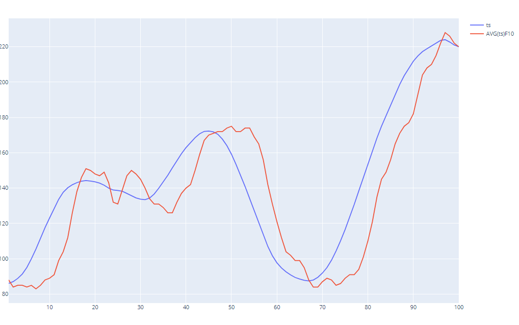
- hana_ml.visualizers.eda.plot_moving_average(data, col, rolling_window, key=None, ax=None, compare=True, enable_plotly=True, fig=None, **kwargs)
-
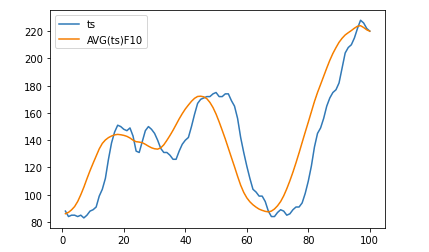
Plot the rolling mean by the given rolling window size.
- Parameters:
-
- dataDataFrame
-
HANA DataFrame containing the data.
- colstr
-
Name of the time series data column.
- rolling_windowint
-
Window size for rolling function. If negative, it will use the points before CURRENT ROW.
- keystr, optional
-
Name of the ID column.
Defaults to the index column of
data(i.e. data.index) if it is set. - axmatplotlib.axes.Axes, optional
-
The axes for the plot.
Default to None.
- comparebool, optional
-
If True, it will plot the data and its moving average. Otherwise, only moving average will be plotted.
Defaults to True.
- enable_plotlybool, optional
-
Use plotly instead of matplotlib.
Defaults to True.
- figplotly.graph_objects.Figure, optional
-
If None, a new graph object will be created. Valid when
enable_plotlyis True.Defaults to None.
- kwargsoptional
-
Keyword/value pair of properties to be updated when
enable_plotlyis True.Defaults to None.
- Returns:
-
- matplotlib:
-
The axes for the plot, returns a matplotlib.axes.Axes object.
- plotly:
-
If
enable_plotlyis True, returns a plotly.graph_objects.Figure object.
Examples
Matplotlib:
>>> plot_moving_average(data=df, key='ID', col='ts', rolling_window=10, enable_plotly=False)
Plotly:
>>> plot_moving_average(data=df, key='ID', col='ts', rolling_window=10, width=600, height=400)
- hana_ml.visualizers.eda.plot_rolling_stddev(data, col, rolling_window, key=None, ax=None, enable_plotly=True, fig=None, **kwargs)
-
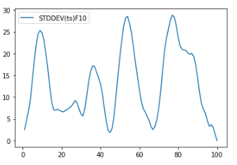
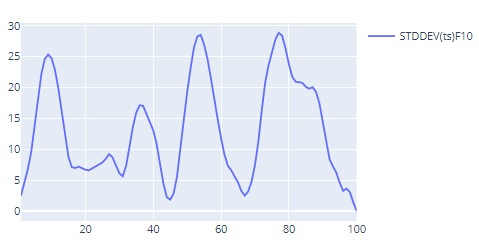
Plot the rolling standard deviation by given rolling window size.
- Parameters:
-
- dataDataFrame
-
HANA DataFrame containing the data.
- colstr
-
Name of the time series data column.
- rolling_windowint, optional
-
Window size for rolling function. If negative, it will use the points before CURRENT ROW.
- keystr, optional
-
Name of the ID column.
Defaults to the index column of
data(i.e. data.index) if it is set. - axmatplotlib.axes.Axes, optional
-
The axes for the plot.
Default to None.
- enable_plotlybool, optional
-
Use plotly instead of matplotlib.
Defaults to True.
- figplotly.graph_objects.Figure, optional
-
If None, a new graph object will be created. Valid when
enable_plotlyis True.Defaults to None.
- kwargsoptional
-
Keyword/value pair of properties to be updated when
enable_plotlyis True.Defaults to None.
- Returns:
-
- matplotlib:
-
The axes for the plot, returns a matplotlib.axes.Axes object.
- plotly:
-
If
enable_plotlyis True, returns a plotly.graph_objects.Figure object.
Examples
Matplotlib:
>>> plot_rolling_stddev(data=df, key='ID', col='ts', rolling_window=10, enable_plotly=False)
Plotly:
>>> plot_rolling_stddev(data=df, key='ID', col='ts', rolling_window=10, width=600, height=400)
- hana_ml.visualizers.eda.plot_seasonal_decompose(data, col, key=None, alpha=None, thread_ratio=None, decompose_type=None, extrapolation=None, smooth_width=None, axes=None, enable_plotly=True, fig=None, **kwargs)
-
Plot the seasonal decomposition.
- Parameters:
-
- dataDataFrame
-
HANA DataFrame containing the data.
- colstr
-
Name of the time series data column.
- keystr, optional
-
Name of the ID column.
Defaults to the index column of
data(i.e. data.index) if it is set. - alphafloat, optional
-
The criterion for the autocorrelation coefficient. The value range is (0, 1). A larger value indicates stricter requirement for seasonality.
Defaults to 0.2.
- thread_ratiofloat, optional
-
Controls the proportion of available threads to use. The ratio of available threads.
-
0: single thread.
-
0~1: percentage.
-
Others: heuristically determined.
Defaults to -1.
-
- decompose_type{'additive', 'multiplicative', 'auto'}, optional
-
Specifies decompose type.
-
'additive': Additive decomposition model.
-
'multiplicative': Multiplicative decomposition model.
-
'auto': Decomposition model automatically determined from input data.
Defaults to 'auto'.
-
- extrapolationbool, optional
-
Specifies whether to extrapolate the endpoints. Set to True when there is an end-point issue.
Defaults to False.
- smooth_widthint, optional
-
Specifies the width of the moving average applied to non-seasonal data. 0 indicates linear fitting to extract trends. Can not be larger than half of the data length.
Defaults to 0.
- axesAxes array, optional
-
The axes for the plot.
- enable_plotlybool, optional
-
Use plotly instead of matplotlib.
Defaults to True.
- figplotly.graph_objects.Figure, optional
-
If None, a new graph object will be created. Valid when
enable_plotlyis True.Defaults to None.
- kwargsoptional
-
Keyword/value pair of properties to be updated when
enable_plotlyis True.Defaults to None.
- Returns:
-
- matplotlib:
-
The axes for the plot, returns a matplotlib.axes.Axes object.
- plotly:
-
If
enable_plotlyis True, returns a plotly.graph_objects.Figure object.
Examples
Matplotlib:
>>> plot_seasonal_decompose(data=df, col='ts', key= 'ID', enable_plotly=False)

Plotly:
>>> plot_seasonal_decompose(data=df, col='ts', key= 'ID', width=600, height=400)

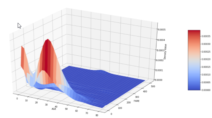
- hana_ml.visualizers.eda.kdeplot(data, key, features=None, kde=<hana_ml.algorithms.pal.kernel_density.KDE object>, points=1000, enable_plotly=True, **kwargs)
-
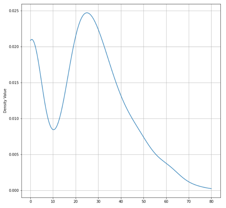
Display a kernel density estimate plot for SAP HANA DataFrame.
- Parameters:
-
- dataDataFrame
-
HANA DataFrame containing the data.
- keystr
-
Name of the ID column in the data.
- featuresstr/list of str, optional
-
Name of the feature columns in the data.
- kdehana_ml.algorithms.pal.kernel_density.KDE, optional
-
KDE Calculation.
Defaults to KDE().
- pointsint, optional
-
The number of points for plotting.
Defaults to 1000.
- enable_plotlybool, optional
-
Use plotly instead of matplotlib.
Defaults to True.
- Returns:
-
- matplotlib:
-
-
The axes for the plot, returns a matplotlib.axes.Axes object.
-
Poly3DCollection, The surface plot object. Only valid for matplotlib 2D plotting.
-
- plotly:
-
If
enable_plotlyis True, returns a plotly.graph_objects.Figure object.
Examples
Matplotlib:
>>> f = plt.figure(figsize=(19, 10))
>>> ax = kdeplot(data=df, key="PASSENGER_ID", features=["AGE"], enable_plotly=False)
>>> ax.grid()
>>> plt.show()
>>> f = plt.figure(figsize=(19, 10))
>>> ax, surf = kdeplot(data=df, key="PASSENGER_ID", features=["AGE", "FARE"], enable_plotly=False)
>>> ax.grid()
>>> plt.show()
Plotly:
>>> fig = kdeplot(data=df.filter("SURVIVED = 1"), key="PASSENGER_ID", features=["AGE"], width=600, height=600)
>>> fig.show()

>>> fig = kdeplot(data=df, key="PASSENGER_ID", features=["AGE", "FARE"], width=600, height=600)
>>> fig.show()

- hana_ml.visualizers.eda.hist(data, columns, bins=None, debrief=False, x_axis_fontsize=10, x_axis_rotation=0, title_fontproperties=None, default_bins=20, rounding_precision=3, replacena=0, enable_plotly=True, **kwargs)
-
Plot histograms for SAP HANA DataFrame.
- Parameters:
-
- dataDataFrame
-
HANA DataFrame containing the data.
- columnslist of str
-
Columns in the DataFrame being plotted.
- binsint or dict, optional
-
The number of bins to create based on the value of column.
Defaults to 20.
- debriefbool, optional
-
Whether to include the skewness debrief.
Defaults to False.
- x_axis_fontsizeint, optional
-
The size of x axis labels.
Defaults to 10.
- x_axis_rotationint, optional
-
The rotation of x axis labels.
Defaults to 0.
- title_fontpropertiesFontProperties, optional
-
Change the font properties for title. Only for Matplotlib plot.
Defaults to None.
- default_binsint, optional
-
The number of bins to create for the column that has not been specified in bins when bins is dict.
Defaults to 20.
- debriefbool, optional
-
Whether to include the skewness debrief.
Defaults to False.
- rounding_precisionint, optional
-
The rounding precision for bin size.
Defaults to 3.
- replacenafloat, optional
-
Replace na with the specified value.
Defaults to 0.
- enable_plotlybool, optional
-
Use plotly instead of matplotlib.
Defaults to True.
- Returns:
-
- matplotlib:
-
The axes for the plot, returns a matplotlib.axes.Axes object.
- plotly:
-
If
enable_plotlyis True, returns a plotly.graph_objects.Figure object.
Examples
Matplotlib:
>>> hist(data=df, columns=['PCLASS', 'AGE', 'SIBSP', 'PARCH', 'FARE'], default_bins=10, bins={"AGE": 10}, enable_plotly=False)

Plotly:
>>> hist(data=df, columns=['PCLASS', 'AGE', 'SIBSP', 'PARCH', 'FARE'], default_bins=10, bins={"AGE": 10})

- hana_ml.visualizers.eda.plot_psd(data, col, key=None, sampling_rate=None, num_fft=None, freq_range=None, spectrum_type=None, window=None, alpha=None, beta=None, attenuation=None, mode=None, precision=None, r=None, title=None, xlabel_name=None, ylabel_name=None, semilogy=False, ax=None, periodogram_res=None, enable_plotly=True, fig=None, **kwargs)
-
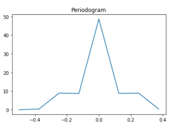
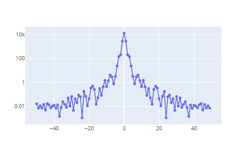
Plot Power Spectral Density (PSD) with periodogram.
- Parameters:
-
- dataDataFrame
-
HANA DataFrame containing the data.
- colstr
-
Name of the time series data column.
- keystr, optional
-
Name of the ID column.
Defaults to the index column of
data(i.e. data.index) if it is set. - sampling_ratefloat, optional
-
Sampling frequency of the sequence.
Defaults to 1.0.
- num_fftinteger, optional
-
Number of DFT points. If
num_fftis smaller than the length of the input, the input is cropped. If it is larger, the input is padded with zeros.Defaults to the length of sequence.
- freq_range{"one_sides", "two_sides"}, optional
-
Indicates result frequency range.
Defaults to "one_sides".
- spectrum_type{"density", "spectrum"}, optional
-
Indicates power spectrum scaling type.
-
"density": power spectrum density.
-
"spectrum": power spectrum.
Defaults to "density".
-
- windowstr, optional
-
Available input window type:
-
'none',
-
'bartlett',
-
'bartlett_hann',
-
'blackman',
-
'blackman_harris',
-
'bohman',
-
'chebwin',
-
'cosine',
-
'flattop',
-
'gaussian',
-
'hamming',
-
'hann',
-
'kaiser',
-
'nuttall',
-
'parzen',
-
'tukey'
No default value.
-
- alphafloat, optional
-
Window parameter. Only valid for blackman and gaussian window. Default values:
-
"Blackman", defaults to 0.16.
-
"Gaussian", defaults to 2.5.
-
- betafloat, optional
-
Parameter for Kaiser Window. Only valid for kaiser window.
Defaults to 8.6.
- attenuationfloat, optional
-
Parameter for Chebwin. Only valid for chewin window.
Defaults to 50.0.
- mode{'symmetric', 'periodic'}, optional
-
Parameter for Flattop Window. Can be:
-
'symmetric'.
-
'periodic'.
Only valid for flattop window. Defaults to 'symmetric'.
-
- precisionstr, optional
-
Parameter for Flattop Window. Can be:
-
'none'
-
'octave'
Only valid for flattop window. Defaults to 'none'.
-
- rfloat, optional
-
Parameter for Tukey Window. Only valid for tukey window.
Defaults to 0.5.
- titlestr, optional
-
The plot title.
Defaults to "Periodogram".
- xlabel_namestr, optional
-
Name of x label.
Defaults to None.
- ylabel_namestr, optional
-
Name of y label.
Defaults to None.
- semilogybool, optional
-
Whether to make a plot with log scaling on the y axis.
Defaults to False.
- axmatplotlib.axes.Axes, optional
-
The axes for the plot.
Default to None.
- periodogram_resDataFrame, optional
-
The returned result DataFrame from function periodogram().
Defaults to None.
- enable_plotlybool, optional
-
Use plotly instead of matplotlib.
Defaults to True.
- figplotly.graph_objects.Figure, optional
-
If None, a new graph object will be created. Valid when
enable_plotlyis True.Defaults to None.
- kwargsoptional
-
Keyword/value pair of properties to be updated when
enable_plotlyis True.Defaults to None.
- Returns:
-
- matplotlib:
-
The axes for the plot, returns a matplotlib.axes.Axes object.
- plotly:
-
If
enable_plotlyis True, returns a plotly.graph_objects.Figure object.
Examples
Matplotlib:
>>> plot_psd(data=df, col="ts", key="ID", sampling_rate=100.0, window="hamming", freq_range="two_sides", title="Periodogram", semilogy=True, enable_plotly=False)
Plotly:
>>> plot_psd(data=df, col="ts", key="ID", sampling_rate=100.0, window="hamming", freq_range="two_sides", title="Periodogram", width=600, height=400, semilogy=True)
- class hana_ml.visualizers.eda.EDAVisualizer(ax=None, size=None, cmap=None, enable_plotly=True, fig=None, no_fig=False, show_plotly=True)
-
Bases:
VisualizerClass for all EDA visualizations, including:
-
bar_plot
-
box_plot
-
correlation_plot
-
distribution_plot
-
pie_plot
-
scatter_plot
- Parameters:
-
- axmatplotlib.axes.Axes, optional
-
The axes used to plot the figure. Only for matplotlib plot.
Default value is current axes.
- sizetuple of integers, optional
-
(width, height) of the plot in dpi. Only for matplotlib plot.
Default value is the current size of the plot.
- cmapmatplotlib.pyplot.colormap, optional
-
Color map used for the plot. Only for matplotlib plot.
Defaults to None.
- enable_plotlybool, optional
-
Use plotly instead of matplotlib.
Defaults to True.
- figFigure, optional
-
Plotly's figure. Only valid when enable_plotly is True.
Defaults to None.
Examples
>>> import matplotlib.pyplot as plt
>>> f = plt.figure(figsize=(10,10))
>>> ax = f.add_subplot(111)
>>> eda = EDAVisualizer(ax=ax, enable_plotly=False)
- Attributes:
Methods
bar_plot(data, column, aggregation[, title, ...])Displays a bar plot for the SAP HANA DataFrame column specified.
box_plot(data, column[, outliers, title, ...])Displays a box plot for the SAP HANA DataFrame column specified.
correlation_plot(data[, key, corr_cols, ...])Displays a correlation plot for the SAP HANA DataFrame columns specified.
distribution_plot(data, column, bins[, ...])Displays a distribution plot for the SAP HANA DataFrame column specified.
pie_plot(data, column[, explode, title, ...])Displays a pie plot for the SAP HANA DataFrame column specified.
reset()Reset.
scatter_plot(data, x, y[, x_bins, y_bins, ...])Displays a scatter plot for the SAP HANA DataFrame columns specified.
set_ax(ax)Sets the Axes
set_cmap(cmap)Sets the colormap
set_size(size)Sets the size
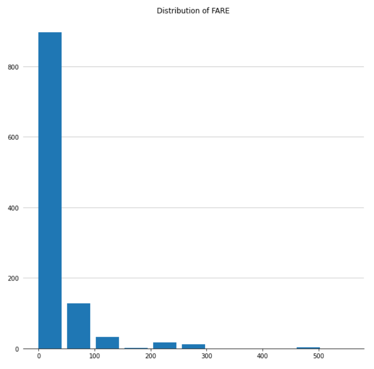
- distribution_plot(data, column, bins, title=None, x_axis_fontsize=10, x_axis_rotation=0, debrief=False, rounding_precision=3, title_fontproperties=None, replacena=0, x_axis_label='', y_axis_label='', subplot_pos=(1, 1), return_bin_data_only=False, **kwargs)
-
Displays a distribution plot for the SAP HANA DataFrame column specified.
- Parameters:
-
- dataDataFrame
-
HANA DataFrame containing the data.
- columnstr
-
Column in the DataFrame being plotted.
- binsint
-
Number of bins to create based on the value of column.
- titlestr, optional
-
Title for the plot.
Defaults to None.
- x_axis_fontsizeint, optional
-
Size of x axis labels.
Defaults to 10.
- x_axis_rotationint, optional
-
Rotation of x axis labels.
Defaults to 0.
- debriefbool, optional
-
Whether to include the skewness debrief.
Defaults to False.
- rounding_precisionint, optional
-
The rounding precision for bin size.
Defaults to 3.
- title_fontpropertiesFontProperties, optional
-
Change the font properties for title.
Defaults to None.
- replacenafloat, optional
-
Replace na with the specified value.
Defaults to 0.
- x_axis_labelstr, optional
-
x axis label. Only for plotly plot.
Defaults to "".
- y_axis_labelstr, optional
-
y axis label. Only for plotly plot.
Defaults to "".
- subplot_postuple, optional
-
(row, col) for plotly subplot. Only for plotly plot.
Defaults to (1, 1).
- Returns:
-
- matplotlib:
-
-
The axes for the plot, returns a matplotlib.axes.Axes object.
-
pandas.DataFrame. The data used in the plot.
-
- plotly:
-
If
enable_plotlyis True:-
plotly.graph_objects.Figure object of the distribution plot.
-
graph object trace. The trace of the plot, used in hist().
-
pandas.DataFrame. The data used in the plot.
-
Examples
Matplotlib:
>>> import matplotlib.pyplot as plt
>>> f = plt.figure(figsize=(35, 10))
>>> ax = f.add_subplot(111)
>>> eda = EDAVisualizer(ax=ax, enable_plotly=False)
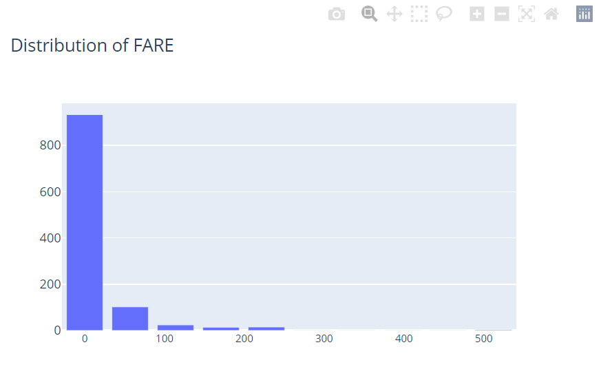
>>> ax, dist_data = eda.distribution_plot(data=df, column="FARE", bins=10, title="Distribution of FARE")
Plotly:
>>> eda = EDAVisualizer(enable_plotly=True)
>>> fig, trace, bin_data = eda.distribution_plot(data=df, column="FARE", bins=10, title="Distribution of FARE", width=600, height=400)
- pie_plot(data, column, explode=0.03, title=None, legend=True, title_fontproperties=None, legend_fontproperties=None, subplot_pos=(1, 1), **kwargs)
-
Displays a pie plot for the SAP HANA DataFrame column specified.
- Parameters:
-
- dataDataFrame
-
HANA DataFrame containing the data.
- columnstr
-
Column in the DataFrame being plotted.
- explodefloat, optional
-
Relative spacing between pie segments. Only for matplotlib plot.
Defaults to 0.03.
- titlestr, optional
-
Title for the plot.
Defaults to None.
- legendbool, optional
-
Whether to show the legend for the plot. Only for matplotlib plot.
Defaults to True.
- title_fontpropertiesFontProperties, optional
-
Change the font properties for title. Only for matplotlib plot.
Defaults to None.
- legend_fontpropertiesFontProperties, optional
-
Change the font properties for legend. Only for matplotlib plot.
Defaults to None.
- subplot_postuple, optional
-
(row, col) for plotly subplot. Only for plotly plot.
Defaults to (1, 1).
- Returns:
-
- matplotlib:
-
-
The axes for the plot, returns a matplotlib.axes.Axes object.
-
pandas.DataFrame. The data used in the plot.
-
- plotly:
-
If
enable_plotlyis True:-
plotly.graph_objects.Figure object of the plot.
-
pandas.DataFrame. The data used in the plot.
-
Examples
Matplotlib:
>>> import matplotlib.pyplot as plt
>>> f = plt.figure(figsize=(8, 8))
>>> ax = f.add_subplot(111)
>>> eda = EDAVisualizer(ax=ax, enable_plotly=False)
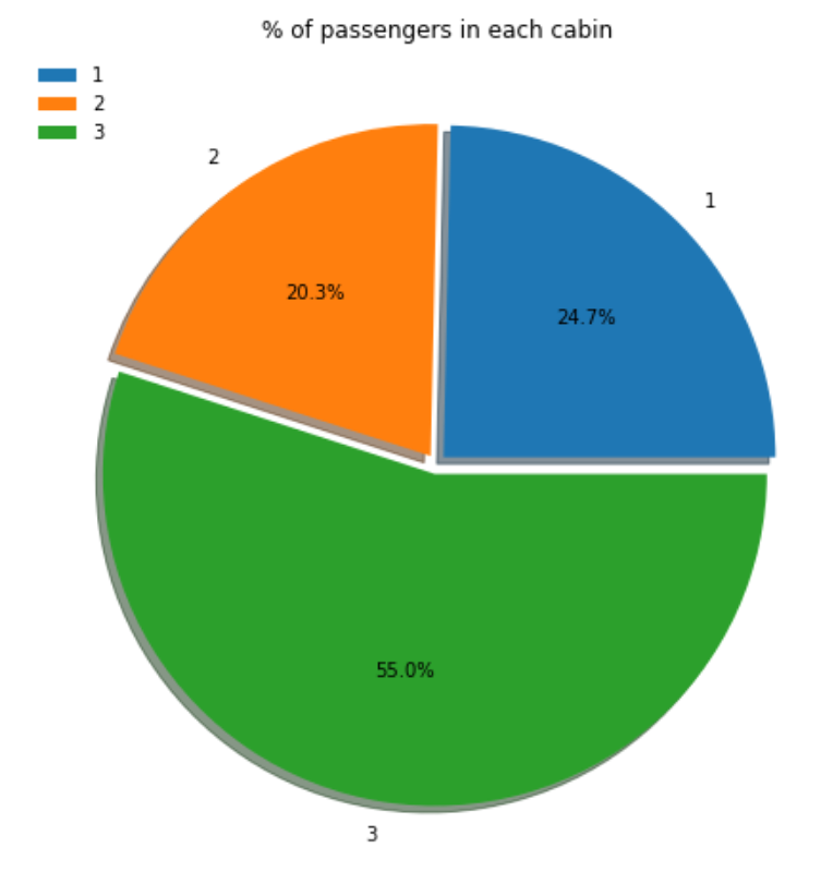
>>> ax, pie_data = eda.pie_plot(data=df, column="PCLASS", title="% of passengers in each class")
Plotly:
>>> eda = EDAVisualizer(enable_plotly=True)
>>> fig, pie_data = eda.pie_plot(data=df, column="PCLASS", title="% of passengers in each class", width=600, height=600)

- correlation_plot(data, key=None, corr_cols=None, label=True, cmap=None, title="Pearson's correlation (r)", **kwargs)
-
Displays a correlation plot for the SAP HANA DataFrame columns specified.
- Parameters:
-
- dataDataFrame
-
HANA DataFrame containing the data.
- keystr, optional
-
Name of ID column.
Defaults to None.
- corr_colslist of str, optional
-
Columns in the DataFrame being plotted. If None then all numeric columns will be plotted.
Defaults to None.
- labelbool, optional
-
Plot a colorbar. Only for matplotlib plot.
Defaults to True.
- cmapmatplotlib.pyplot.colormap or str, optional
-
Color map used for the plot.
Defaults to "RdYlBu" for matplotlib and "blues" for plotly.
- titlestr, optional
-
Title of the plot.
Defaults to "Pearson's correlation (r)".
- Returns:
-
- matplotlib:
-
-
The axes for the plot, returns a matplotlib.axes.Axes object.
-
pandas.DataFrame. The data used in the plot.
-
- plotly:
-
If
enable_plotlyis True:-
plotly.graph_objects.Figure object of the plot.
-
pandas.DataFrame. The data used in the plot.
-
Examples
Matplotlib:
>>> import matplotlib.pyplot as plt
>>> f = plt.figure(figsize=(35, 10))
>>> ax = f.add_subplot(111)
>>> eda = EDAVisualizer(ax=ax, enable_plotly=False)
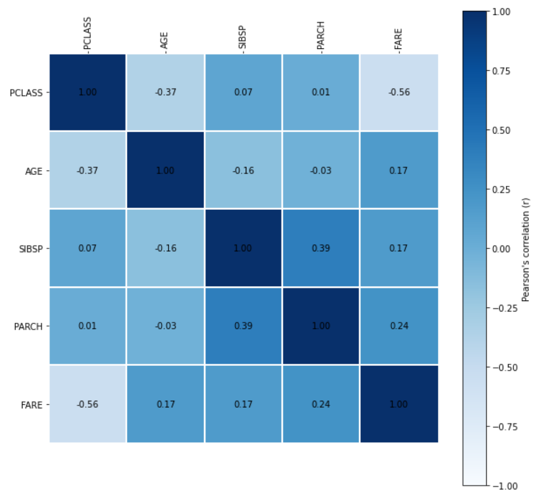
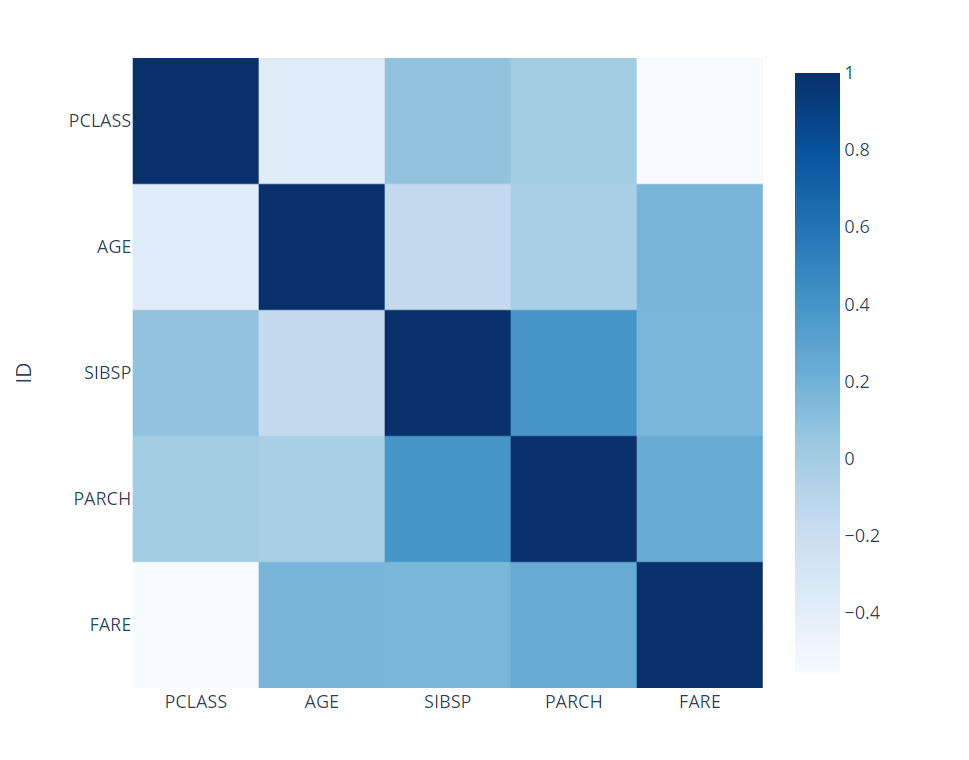
>>> ax, corr = eda.correlation_plot(data=df, corr_cols=['PCLASS', 'AGE', 'SIBSP', 'PARCH', 'FARE'], cmap="Blues")
Plotly:
>>> eda = EDAVisualizer(enable_plotly=True)
>>> fig, _ = eda.correlation_plot(data=df, corr_cols=['PCLASS', 'AGE', 'SIBSP', 'PARCH', 'FARE'], cmap="Blues", width=600, height=600, title="correlation plot")
- scatter_plot(data, x, y, x_bins=None, y_bins=None, title=None, label=None, cmap=None, debrief=True, rounding_precision=3, label_fontsize=12, title_fontproperties=None, sample_frac=1.0, **kwargs)
-
Displays a scatter plot for the SAP HANA DataFrame columns specified.
- Parameters:
-
- dataDataFrame
-
HANA DataFrame containing the data.
- xstr
-
Column to be plotted on the x axis.
- ystr
-
Column to be plotted on the y axis.
- x_binsint, optional
-
Number of x axis bins to create based on the value of column.
Defaults to None.
- y_binsint
-
Number of y axis bins to create based on the value of column.
Defaults to None.
- titlestr, optional
-
Title for the plot.
Defaults to None.
- labelstr, optional
-
Label for the color bar.
Defaults to None.
- cmapmatplotlib.pyplot.colormap or str, optional
-
Color map used for the plot.
Defaults to "Blues" for matplotlib and "blues" for plotly.
- debriefbool, optional
-
Whether to include the correlation debrief.
Defaults to True
- rounding_precisionint, optional
-
The rounding precision for bin size. Only for matplotlib plot.
Defaults to 3.
- label_fontsizeint, optional
-
Change the font size for label. Only for matplotlib plot.
Defaults to 12.
- title_fontpropertiesFontProperties, optional
-
Change the font properties for title.
Defaults to None.
- sample_fracfloat, optional
-
Sampling method is applied to data. Valid if x_bins and y_bins are not set.
Defaults to 1.0.
- Returns:
-
- matplotlib:
-
If enable_plotly is False:
-
The axes for the plot, returns a matplotlib.axes.Axes object.
-
pandas.DataFrame. The data used in the plot.
-
- plotly:
-
If
enable_plotlyis True:-
plotly.graph_objects.Figure object of the plot.
-
Examples
Matplotlib:
>>> import matplotlib.pyplot as plt
>>> f = plt.figure(figsize=(10, 10))
>>> ax = f.add_subplot(111)
>>> eda = EDAVisualizer(ax=ax, enable_plotly=False)
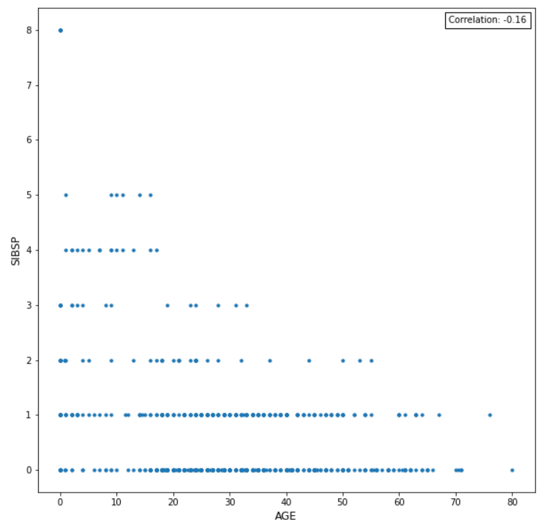
>>> ax, corr = eda.scatter_plot(data=df, x="AGE", y="SIBSP", x_bins=5, y_bins=5)

Plotly:
>>> eda = EDAVisualizer(enable_plotly=True)
>>> fig = eda.scatter_plot(data=df, x="AGE", y="SIBSP", x_bins=5, y_bins=5, width=600, height=600)
>>> fig.show()

>>> f = plt.figure(figsize=(10, 10))
>>> ax2 = f.add_subplot(111)
>>> eda = EDAVisualizer(ax=ax2, enable_plotly=False)
>>> ax2 = eda.scatter_plot(data=df, x="AGE", y="SIBSP", sample_frac=0.8, s=10, marker='o')
Plotly:
>>> eda = EDAVisualizer(enable_plotly=True)
>>> fig = eda.scatter_plot(data=df, x="AGE", y="SIBSP", sample_frac=0.8, width=600, height=600)

- bar_plot(data, column, aggregation, title=None, label_fontsize=12, title_fontproperties=None, orientation=None, **kwargs)
-
Displays a bar plot for the SAP HANA DataFrame column specified.
- Parameters:
-
- dataDataFrame
-
HANA DataFrame containing the data.
- columnstr
-
Column to be aggregated.
- aggregationdict
-
Aggregation conditions ('avg', 'count', 'max', 'min').
- titlestr, optional
-
Title for the plot.
Defaults to None.
- label_fontsizeint, optional
-
The size of label. Only for matplotlib plot.
Defaults to 12.
- title_fontpropertiesFontProperties, optional
-
Change the font properties for title.
Defaults to None.
- orientationstr, optional
-
One of 'h' for horizontal or 'v' for vertical.
Only valid when plotly plot is enabled.
Defaults to 'v'.
- Returns:
-
- matplotlib:
-
-
The axes for the plot, returns a matplotlib.axes.Axes object.
-
pandas.DataFrame. The data used in the plot.
-
- plotly:
-
If
enable_plotlyis True:-
plotly.graph_objects.Figure object of the plot.
-
pandas.DataFrame. The data used in the plot.
-
Examples
Matplotlib:
>>> import matplotlib.pyplot as plt
>>> f = plt.figure(figsize=(10,10))
>>> ax = f.add_subplot(111)
>>> eda = EDAVisualizer(ax=ax, enable_plotly=False)
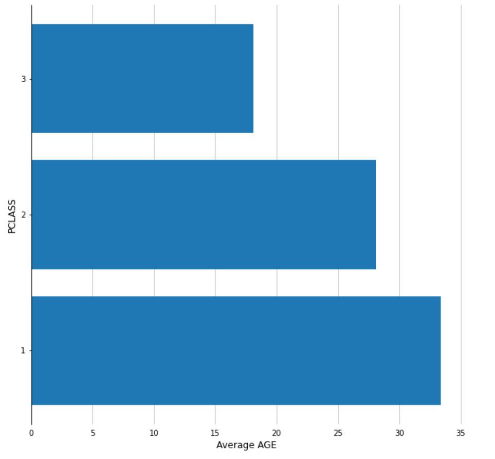
>>> ax, bar = eda.bar_plot(data=df, column="PCLASS", aggregation={'AGE':'avg'})
Plotly:
>>> eda = EDAVisualizer(enable_plotly=True)
>>> fig, bar = eda.bar_plot(data=df, column="PCLASS", aggregation={'AGE':'avg'}, width=600, height=600, title="bar plot")

- box_plot(data, column, outliers=False, title=None, groupby=None, lower_outlier_fence_factor=0, upper_outlier_fence_factor=0, title_fontproperties=None, vert=False, legend=True, multiplier=1.5, **kwargs)
-
Displays a box plot for the SAP HANA DataFrame column specified.
- Parameters:
-
- dataDataFrame
-
HANA DataFrame containing the data.
- columnstr
-
Column in the DataFrame being plotted.
- outliersbool
-
Whether to plot suspected outliers and outliers.
Defaults to False.
- titlestr, optional
-
Title for the plot.
Defaults to None.
- groupbystr, optional
-
Column to group by and compare.
Defaults to None.
- lower_outlier_fence_factorfloat, optional
-
The lower bound of outlier fence factor.
Defaults to 0.
- upper_outlier_fence_factor
-
The upper bound of outlier fence factor.
Defaults to 0.
- title_fontpropertiesFontProperties, optional
-
Change the font properties for title.
Defaults to None.
- vertbool, optional
-
Vertical box plot if True.
Defaults to False.
- legendbool, optional
-
Display legend if True. Only available for matplotlib.
Defaults to True.
- multiplierfloat, optional
-
The multiplier used in the IQR test.
Defaults to 1.5.
- Returns:
-
- matplotlib:
-
-
The axes for the plot, returns a matplotlib.axes.Axes object.
-
pandas.DataFrame. The data used in the plot.
-
- plotly:
-
If
enable_plotlyis True:-
plotly.graph_objects.Figure object of the plot.
-
pandas.DataFrame. The data used in the plot.
-
Examples
Matplotlib:
>>> import matplotlib.pyplot as plt
>>> f = plt.figure(figsize=(10, 10))
>>> ax = f.add_subplot(111)
>>> eda = EDAVisualizer(ax=ax, enable_plotly=False)
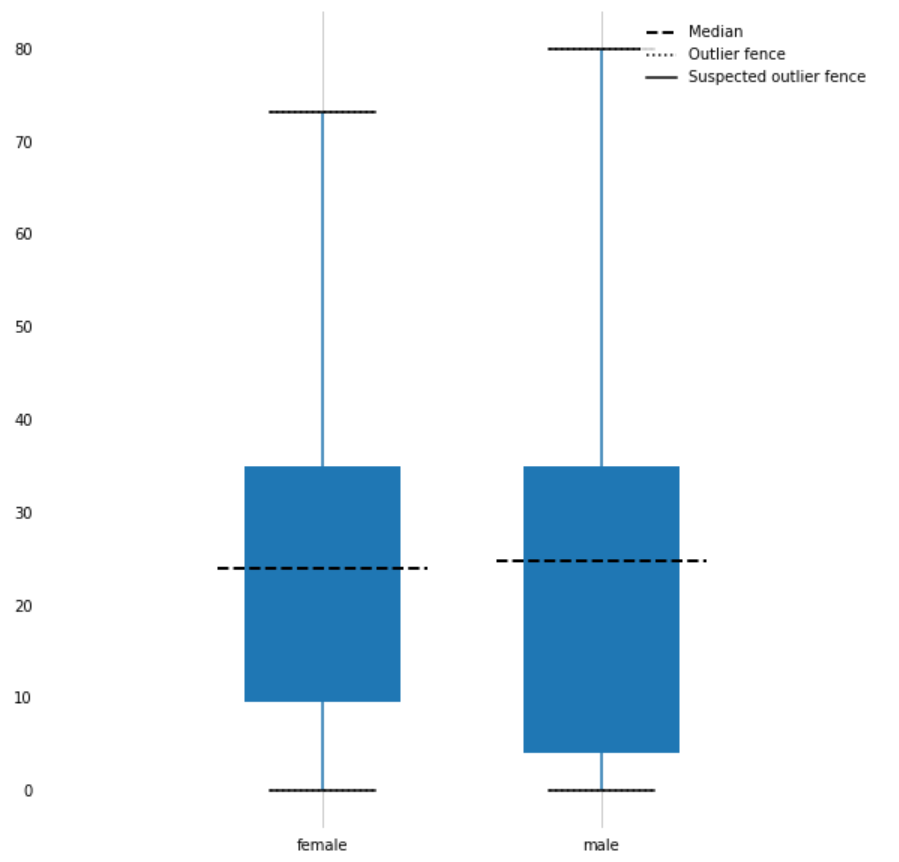
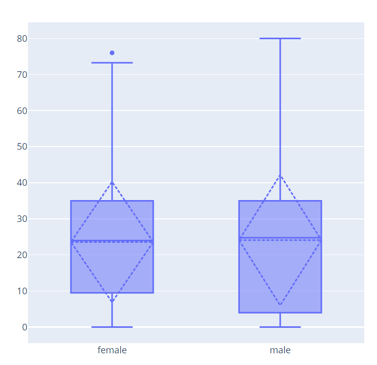
>>> ax, corr = eda.box_plot(data=df, column="AGE", vert=True, groupby="SEX")
Plotly:
>>> eda = EDAVisualizer(enable_plotly=True)
>>> fig, corr = eda.box_plot(data=df, column="AGE", groupby="SEX", vert=True, width=600, height=600, title="box plot")
- property ax
-
Returns the matplotlib Axes where the Visualizer will draw.
- property cmap
-
Returns the color map being used for the plot.
- reset()
-
Reset.
- set_ax(ax)
-
Sets the Axes
- set_cmap(cmap)
-
Sets the colormap
- set_size(size)
-
Sets the size
- property size
-
Returns the size of the plot in pixels.
-
- class hana_ml.visualizers.eda.Profiler(*args, **kwargs)
-
Bases:
objectA class to build a SAP HANA Profiler, including:
-
Variable descriptions
-
Missing values %
-
High cardinality %
-
Skewness
-
Numeric distributions
-
Categorical distributions
-
Correlations
-
High correlation warnings
Methods
description(data, key[, bins, ...])Returns a SAP HANA profiler, including:
set_size(fig, figsize)Set the size of the data description plot, in inches.
- description(data, key, bins=20, missing_threshold=10, card_threshold=100, skew_threshold=0.5, figsize=None)
-
Returns a SAP HANA profiler, including:
-
Variable descriptions
-
Missing values %
-
High cardinality %
-
Skewness
-
Numeric distributions
-
Categorical distributions
-
Correlations
-
High correlation warnings
- Parameters:
-
- dataDataFrame
-
HANA DataFrame containing the data.
- keystr, optional
-
Name of the key column in the DataFrame.
- binsint, optional
-
Number of bins for numeric distributions.
Defaults to 20.
- missing_thresholdfloat
-
Percentage threshold to display missing values.
Defaults to 10.
- card_thresholdint
-
Threshold for column to be considered with high cardinality.
Defaults to 100.
- skew_thresholdfloat
-
Absolute value threshold for column to be considered as highly skewed.
Defaults to 0.5.
- figsizetuple, optional
-
Size of figure to be plotted. First element is width, second is height.
Defaults to None.
- Note: categorical columns with cardinality warnings are not plotted.
- Returns:
-
- The matplotlib axis of the profiler
-
- set_size(fig, figsize)
-
Set the size of the data description plot, in inches.
- Parameters:
-
- figax
-
The returned axes constructed by the description method.
- figsizetuple
-
Tuple of width and height for the plot.
-
hana_ml.visualizers.metrics
This module represents a visualizer for metrics.
The following class is available:
- class hana_ml.visualizers.metrics.MetricsVisualizer(ax=None, size=None, cmap=None, title=None, enable_plotly=True, show_plotly=True)
-
Bases:
Visualizer,objectThe MetricVisualizer is used to visualize metrics.
- Parameters:
-
- axmatplotlib.Axes, optional
-
The axes to use to plot the figure.
Default value : Current axes
- sizetuple of integers, optional
-
(width, height) of the plot in dpi
Default value: Current size of the plot.
- cmapmatplotlib.pyplot.colormap or str, optional
-
Color map used for the plot.
Defaults to None.
- titlestr, optional
-
Title for the plot.
Defaults to None.
- enable_plotlybool, optional
-
Use plotly instead of matplotlib.
Defaults to True.
- Attributes:
Methods
plot_confusion_matrix(df[, normalize, rotate])This function plots the confusion matrix and returns the Axes where this is drawn.
reset()Reset.
set_ax(ax)Sets the Axes
set_cmap(cmap)Sets the colormap
set_size(size)Sets the size
- plot_confusion_matrix(df, normalize=False, rotate=False, **kwargs)
-
This function plots the confusion matrix and returns the Axes where this is drawn.
- Parameters:
-
- dfDataFrame
-
Data points to the resulting confusion matrix. This dataframe's columns should match columns ('CLASS', '')
- normalizebool, optional
-
Whether to normalize the input data.
Defaults to False.
- property ax
-
Returns the matplotlib Axes where the Visualizer will draw.
- property cmap
-
Returns the color map being used for the plot.
- reset()
-
Reset.
- set_ax(ax)
-
Sets the Axes
- set_cmap(cmap)
-
Sets the colormap
- set_size(size)
-
Sets the size
- property size
-
Returns the size of the plot in pixels.
hana_ml.visualizers.m4_sampling
This module contains M4 algorithm for sampling query.
The following function is available:
- hana_ml.visualizers.m4_sampling.get_min_index(data)
-
Get Minimum Timestamp of Time Series Data Only for internal use, do not show it in the doc.
- Parameters:
-
- dataDataFrame
-
Time series data whose the 1st column is index and the 2nd one is value.
- Returns:
-
- datetime
-
Return the minimum timestamp.
- hana_ml.visualizers.m4_sampling.get_max_index(data)
-
Get Maximum Timestamp of Time Series Data Only for internal use, do not show it in the doc.
- Parameters:
-
- dataDataFrame
-
Time series data whose 1st column is index and 2nd one is value.
- Returns:
-
- datetime
-
Return the maximum timestamp.
- hana_ml.visualizers.m4_sampling.m4_sampling(data, width)
-
M4 algorithm for big data visualization
- Parameters:
-
- dataDataFrame
-
Data to be sampled. Time series data whose 1st column is index and 2nd one is value.
- widthint
-
Sampling Rate. It is an indicator of how many pixels being in the picture.
- Returns:
-
- DataFrame
-
Return the sampled dataframe.
hana_ml.visualizers.model_debriefing
This module represents a visualizer for tree model.
The following class is available:
- class hana_ml.visualizers.model_debriefing.TreeModelDebriefing
-
Bases:
objectVisualize tree model.
Currently, the TreeModelDebriefing class can be used to parse tree model built with the PAL algorithm, but it cannot be used to parse tree model built with the APL algorithm.
The TreeModelDebriefing class can be used to parse tree model generated by the following classes:
-
Classes in hana_ml.algorithms.pal.trees module
-
RDTClassifier
-
RDTRegressor
-
RandomForestClassifier
-
RandomForestRegressor
-
DecisionTreeClassifier
-
DecisionTreeRegressor
-
HybridGradientBoostingClassifier
-
HybridGradientBoostingRegressor
-
-
Class UnifiedClassification
Supported the following values of parameter
func:-
RandomDecisionTree
-
DecisionTree
-
HybridGradientBoostingTrees
-
Examples
-
Using RDTClassifier class
Input DataFrame:
>>> df.collect()
      OUTLOOK     TEMP  HUMIDITY WINDY        LABEL
 0      Sunny     75.0      70.0   Yes         Play
 1      Sunny     80.0      90.0   Yes  Do not Play
...
12       Rain     68.0      80.0    No         Play
13       Rain     70.0      96.0    No         Play
Creating RDTClassifier instance:
>>> from hana_ml.algorithms.pal.trees import RDTClassifier
>>> rdtc = RDTClassifier(n_estimators=3,
...                      max_features=3,
...                      random_state=2,
...                      split_threshold=0.00001,
...                      calculate_oob=True,
...                      min_samples_leaf=1,
...                      thread_ratio=1.0)
Performing fit():
>>> rdtc.fit(data=df, features=['OUTLOOK', 'TEMP', 'HUMIDITY', 'WINDY'], label='CLASS')
Visualize tree model in JSON format:
>>> TreeModelDebriefing.tree_debrief(rdtc.model_)

Visualize tree model in DOT format:
>>> TreeModelDebriefing.tree_debrief_with_dot(rdtc.model_, iframe_height=500)

Visualize tree model in XML format:
>>> rdtc = RDTClassifier(n_estimators=3,
...                      max_features=3,
...                      random_state=2,
...                      split_threshold=0.00001,
...                      calculate_oob=True,
...                      min_samples_leaf=1,
...                      thread_ratio=1.0,
...                      model_format='pmml')
>>> rdtc.fit(data=df, features=['OUTLOOK', 'TEMP', 'HUMIDITY', 'WINDY'], label='CLASS')
>>> TreeModelDebriefing.tree_debrief(rdtc.model_)

-
Using UnifiedClassification class
>>> from hana_ml.algorithms.pal.unified_classification import UnifiedClassification
>>> rdt_params = dict(random_state=2,
                      split_threshold=1e-7,
                      min_samples_leaf=1,
                      n_estimators=10,
                      max_depth=55)
>>> uc_rdt = UnifiedClassification(func='RandomDecisionTree', **rdt_params)
>>> uc_rdt.fit(data=df,
               partition_method='stratified',
               stratified_column='CLASS',
               partition_random_state=2,
               training_percent=0.7,
               ntiles=2)
>>> TreeModelDebriefing.tree_debrief(uc_rdt.model_[0])
>>> TreeModelDebriefing.tree_debrief_with_dot(uc_rdt.model_[0], iframe_height=500)
Methods
shapley_explainer(reason_code_data, feature_data)Create Shapley explainer to explain the output of machine learning model.
tree_debrief(model[, display])Visualize tree model by data in JSON or XML format.
tree_debrief_with_dot(model[, ...])Visualize tree model by data in DOT format.
tree_export(model, filename)Save the tree model as a html file.
tree_export_with_dot(model, filename)Save the tree model as a html file.
tree_parse(model)Transform tree model content using DOT language.
- static tree_debrief(model, display=True)
-
Visualize tree model by data in JSON or XML format.
- Parameters:
-
- modelDataFrame
-
Tree model.
- displaybool, optional
-
Whether to display the tree model.
Defualts to True.
- Returns:
-
- HTML Page
-
This HTML page can be rendered by browser.
- static tree_export(model, filename)
-
Save the tree model as a html file.
- Parameters:
-
- modelDataFrame
-
Tree model.
- filenamestr
-
Html file name.
- static tree_parse(model)
-
Transform tree model content using DOT language.
- Parameters:
-
- modelDataFrame
-
Tree model.
- static tree_debrief_with_dot(model, iframe_height: int = 800, digraph_config: DigraphConfig = None, display=True)
-
Visualize tree model by data in DOT format.
- Parameters:
-
- modelDataFrame
-
Tree model.
- iframe_heightint, optional
-
Frame height.
Defaults to 800.
- digraph_configDigraphConfig, optional
-
Configuration instance of digraph.
- displaybool, optional
-
Whether to display the tree model.
Defualts to True.
- Returns:
-
- HTML Page
-
This HTML page can be rendered by browser.
- static tree_export_with_dot(model, filename)
-
Save the tree model as a html file.
- Parameters:
-
- modelDataFrame
-
Tree model.
- filenamestr
-
Html file name.
- static shapley_explainer(reason_code_data: DataFrame, feature_data: DataFrame, reason_code_column_name=None, **kwargs)
-
Create Shapley explainer to explain the output of machine learning model.
It connects optimal credit allocation with local explanations using the classic Shapley values from game theory and their related extensions.
To get an overview of which features are most important for a model we can plot the Shapley values of every feature for every sample.
- Parameters:
-
- reason_code_dataDataFrame
-
The Dataframe containing only reason code values.
- feature_dataDataFrame
-
The Dataframe containing only feature values.
- reason_code_column_namestr, optional
-
The name of reason code column.
Defaults to None.
- Returns:
-
ShapleyExplainer-
Shapley explainer.
-
hana_ml.visualizers.dataset_report
- class hana_ml.visualizers.dataset_report.DatasetReportBuilder
-
Bases:
objectThe DatasetReportBuilder instance can analyze the dataset and generate a report in HTML format.
The instance will call the dropna method of DataFrame internally to handle the missing value of dataset.
The generated report can be embedded in a notebook, including:
-
- Overview
-
-
Dataset Info
-
Variable Types
-
High Cardinality %
-
Highly Skewed Variables
-
-
- Sample
-
-
Top ten rows of dataset
-
-
- Variables
-
-
Numeric distributions
-
Categorical distributions
-
Variable statistics
-
-
Data Correlations
-
Data Scatter Matrix
Examples
Create a DatasetReportBuilder instance:
>>> from hana_ml.visualizers.dataset_report import DatasetReportBuilder
>>> datasetReportBuilder = DatasetReportBuilder()
Assume the dataset DataFrame is df and then analyze the dataset:
>>> datasetReportBuilder.build(df, key="ID")
Display the dataset report as a notebook iframe.
>>> datasetReportBuilder.generate_notebook_iframe_report()

Methods
build(data, key[, scatter_matrix_sampling, ...])Build a report for dataset.
generate_html_report(filename)Save the dataset report as a html file.
Render the dataset report as a notebook iframe.
Return the iframe report.
Return the html report.
- build(data, key, scatter_matrix_sampling: Sampling = None, ignore_scatter_matrix: bool = False, ignore_correlation: bool = False, subset_bins=None)
-
Build a report for dataset.
Note that the name of data is used as the dataset name in this function. If the name of data (which is a dataframe.DataFrame object) is not set explicitly in the object instantiation, a name like 'DT_XX' will be assigned to the data.
- Parameters:
-
- dataDataFrame
-
DataFrame to use to build the dataset report.
- keystr
-
Name of ID column.
- scatter_matrix_sampling
Sampling, optional -
Scatter matrix sampling.
- ignore_scatter_matrixbool, optional
-
Skip calculating scatter matrix.
Defaults to False.
- ignore_correlationbool, optional
-
Skip calculating correlation.
Defaults to False.
- generate_html_report(filename)
-
Save the dataset report as a html file.
- Parameters:
-
- filenamestr
-
Html file name.
- generate_notebook_iframe_report()
-
Render the dataset report as a notebook iframe.
- get_report_html()
-
Return the html report.
- get_iframe_report_html()
-
Return the iframe report.
-
hana_ml.visualizers.shap
This module provides some explainers for Shapley values.
The following classes are available:
- class hana_ml.visualizers.shap.ShapleyExplainer(reason_code_data: DataFrame, feature_data: DataFrame, reason_code_column_name=None, key=None, label=None)
-
Bases:
objectSHAP (SHapley Additive exPlanations) is a game theoretic approach to explain the output of machine learning model.
It connects optimal credit allocation with local explanations using the classic Shapley values from game theory and their related extensions.
To get an overview of which features are most important for a model we can plot the Shapley values of every feature for every sample.
If the output table contains the reason code column, the output table can be parsed by this class in most cases, rather than only valid for the tree model.
- Parameters:
-
- reason_code_dataDataFrame
-
The Dataframe containing reason code values.
- feature_dataDataFrame
-
The Dataframe containing feature values.
- reason_code_column_namestr, optional
-
The name of reason code column in
reason_code_data.Defaults to the last column of
reason_code_data. - keystr, optional
-
The index column of
feature_data.If provided,
feature_datawill be sorted bykey; besides, ifkeyalso appears in the columns ofreason_code_data,reason_code_datawill also be sorted bykey.Defaults to None, implying that
feature_dataandreason_code_datahave already been sorted so that they correspond by row numbers.Note
It is encouraged that the users pre-sort the feature values and reason code so that the two inputs simply corresond by row numbers. If this is not the case, they should include a common index column(i.e.
key) conveying the correspondence between input feature values and SHAP values. - labelstr, optional
-
If the label exists in
feature_data, it should be provided.Defaults to None.
Examples
In the following example, training data is called diabetes_train and test data is diabetes_test.
First, we create an UnifiedClassification instance:
>>> uc_hgbdt = UnifiedClassification('HybridGradientBoostingTree')
Then, create a GridSearchCV instance:
>>> gscv = GridSearchCV(estimator=uc_hgbdt,
...                     param_grid={'learning_rate': [0.1, 0.4, 0.7, 1],
...                                 'n_estimators': [4, 6, 8, 10],
...                                 'split_threshold': [0.1, 0.4, 0.7, 1]},
...                     train_control=dict(fold_num=5,
...                                        resampling_method='cv',
...                                        random_state=1,
...                                        ref_metric=['auc']),
...                     scoring='error_rate')
Call the fit() function to train the model:
>>> gscv.fit(data=diabetes_train, key= 'ID',
...          label='CLASS',
...          partition_method='stratified',
...          partition_random_state=1,
...          stratified_column='CLASS',
...          build_report=True)
>>> features = diabetes_train.columns
>>> features.remove('CLASS')
>>> features.remove('ID')
Use diabetes_test for prediction:
>>> pred_res = gscv.predict(diabetes_test, key='ID', features=features)
Create a ShapleyExplainer class and then invoke summary_plot() :
>>> shapley_explainer = ShapleyExplainer(reason_code_data=pred_res.sort('ID').select('REASON_CODE'),
...                                      feature_data=diabetes_test.sort('ID').select(features))
>>> shapley_explainer.summary_plot()
You can obtain the SAHP summary report by clicking on the corresponding tag and switching to the Beeswarm Plot / Bar Plot / Dependence Plot / Enhanced Dependence Plot page:


Obtain the force plot:
>>> shapley_explainer.force_plot()
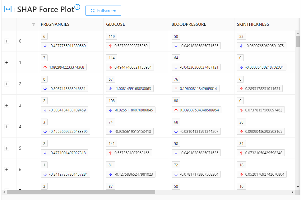
Methods
force_plot([iframe_height])Draw the force plot.
Get bar plot item.
Get beeswarm plot item.
Get dependence plot item.
Get enhanced dependence plot item.
Get feature value and effect.
Get the force plot item.
summary_plot([iframe_height])Global Interpretation using Shapley values.
- get_feature_value_and_effect()
-
Get feature value and effect.
- Parameters:
-
- None
- Returns:
-
- An object of class 'FeatureValueAndEffect'.
- get_force_plot_item()
-
Get the force plot item.
- Parameters:
-
- None
- Returns:
-
- An object of class 'ForcePlotItem'.
- get_beeswarm_plot_item()
-
Get beeswarm plot item.
- Parameters:
-
- None
- Returns:
-
- An object of class 'BeeswarmPlot'.
- get_bar_plot_item()
-
Get bar plot item.
- Parameters:
-
- None
- Returns:
-
- An object of class 'BarPlot'.
- get_dependence_plot_items()
-
Get dependence plot item.
- Parameters:
-
- None
- Returns:
-
- An object of class 'DependencePlot'.
- get_enhanced_dependence_plot_items()
-
Get enhanced dependence plot item.
- Parameters:
-
- None
- Returns:
-
- An object of class 'EnhancedDependencePlot'.
- force_plot(iframe_height=800)
-
Draw the force plot.
- Parameters:
-
- iframe_heightint, optional
-
iframe height.
Defaults to 800.
- Returns:
-
- Renders the force plot as a notebook iframe.
- summary_plot(iframe_height=600)
-
Global Interpretation using Shapley values.
To get an overview of which features are most important for a model we can plot the Shapley values of every feature for every sample.
- Parameters:
-
- iframe_heightint, optional
-
iframe height.
Defaults to 600.
- Returns:
-
- Renders the summary plot as a notebook iframe.
- class hana_ml.visualizers.shap.TimeSeriesExplainer
-
Bases:
objectThe TimeSeriesExplainer instance can visualize the training and prediction results of time series.
The generated html can be embedded in a notebook, including:
-
Compare
-
YHAT
-
YHAT_LOWER
-
YHAT_UPPER
-
REAL_Y
-
-
Trend
-
Seasonal
-
Holiday
-
Exogenous variable
Methods
explain_additive_model(amf[, iframe_height])The static method can visualize the training and prediction results of AdditiveModelForecast.
explain_arima_model(arima[, iframe_height])The static method can visualize the training and prediction results of ARIMA.
- static explain_arima_model(arima, iframe_height=800)
-
The static method can visualize the training and prediction results of ARIMA.
The generated html can be embedded in a notebook, including:
-
Compare
-
PREDICTIVE_Y
-
REAL_Y
-
-
Trend
-
Seasonal
-
Holiday
-
Exogenous variable
- Parameters:
-
- arimaARIMA instance
-
An ARIMA instance.
- iframe_heightint, optional
-
Specifies iframe height.
Defaults to 800.
-
- static explain_additive_model(amf, iframe_height=800)
-
The static method can visualize the training and prediction results of AdditiveModelForecast.
The generated html can be embedded in a notebook, including:
-
Compare
-
YHAT
-
YHAT_LOWER
-
YHAT_UPPER
-
REAL_Y
-
-
Trend
-
Seasonal
-
Holiday
-
Exogenous variable
- Parameters:
-
- amfadditive_model_forecast.AdditiveModelForecast
-
AdditiveModelForecast instances.
- iframe_heightint, optional
-
Specifies iframe height.
Defaults to 800.
-
-
hana_ml.visualizers.unified_report
This module is to build report for PAL/APL models.
The following class is available:
- class hana_ml.visualizers.unified_report.UnifiedReport(obj)
-
Bases:
objectThe report generator for PAL/APL models. Currently, it only supports UnifiedClassification and UnifiedRegression.
Examples
Data used is called diabetes_train.
Case 1: UnifiedReport for UnifiedClassification is shown as follows, please set build_report=True in the fit() function:
>>> from hana_ml.algorithms.pal.model_selection import GridSearchCV
>>> from hana_ml.algorithms.pal.model_selection import RandomSearchCV
>>> hgc = UnifiedClassification('HybridGradientBoostingTree')
>>> gscv = GridSearchCV(estimator=hgc,
                        param_grid={'learning_rate': [0.1, 0.4, 0.7, 1],
                                    'n_estimators': [4, 6, 8, 10],
                                    'split_threshold': [0.1, 0.4, 0.7, 1]},
                        train_control=dict(fold_num=5,
                                           resampling_method='cv',
                                           random_state=1,
                                           ref_metric=['auc']),
                        scoring='error_rate')
>>> gscv.fit(data=diabetes_train, key= 'ID',
             label='CLASS',
             partition_method='stratified',
             partition_random_state=1,
             stratified_column='CLASS',
             build_report=True)
To look at the dataset report:
>>> UnifiedReport(diabetes_train).build().display()

To see the model report:
>>> UnifiedReport(gscv.estimator).display()

We could also see the Optimal Parameter page:

Case 2: UnifiedReport for UnifiedRegression is shown as follows, please set build_report=True in the fit() function:
>>> hgr = UnifiedRegression(func = 'HybridGradientBoostingTree')
>>> gscv = GridSearchCV(estimator=hgr,
                        param_grid={'learning_rate': [0.1, 0.4, 0.7, 1],
                                    'n_estimators': [4, 6, 8, 10],
                                    'split_threshold': [0.1, 0.4, 0.7, 1]},
                        train_control=dict(fold_num=5,
                                           resampling_method='cv',
                                           random_state=1),
                        scoring='rmse')
>>> gscv.fit(data=diabetes_train, key= 'ID',
             label='CLASS',
             partition_method='random',
             partition_random_state=1,
             build_report=True)
To see the model report:
>>> UnifiedReport(gscv.estimator).display()

Methods
build([key, scatter_matrix_sampling, ...])Build the report.
display([save_html, metric_sampling])Display the report.
Return iframe report without display.
set_metric_samplings([roc_sampling, ...])Set metric samplings to report builder.
set_model_report_style(version)Switch different style of model report
tree_debrief([save_html, digraph])Visualize tree model.
- set_model_report_style(version)
-
Switch different style of model report
- Parameters:
-
- version{'v2', 'v1'}, optional
-
new: using report builder framework. old: using pure html template.
Defaults to 'v2'.
- build(key=None, scatter_matrix_sampling: Sampling = None, ignore_scatter_matrix: bool = False, ignore_correlation: bool = False, subset_bins=None)
-
Build the report.
- Parameters:
-
- keystr, valid only for DataFrame
-
Name of ID column.
Defaults to the first column.
- scatter_matrix_sampling
Sampling, valid only for DataFrame -
Scatter matrix sampling.
- ignore_scatter_matrixbool, optional
-
Ignore the plotting of scatter matrix if True.
Defaults to False.
- ignore_correlationbool, optional
-
Ignore the correlation computation if True.
Defaults to False.
- subset_binsdict, optional
-
Define the bin number in distribution chart for each column, e.g. {"col_A": 20}.
Defaults to 20 for all.
- set_metric_samplings(roc_sampling: Sampling = None, other_samplings: dict = None)
-
Set metric samplings to report builder.
- Parameters:
-
- roc_sampling
Sampling, optional -
ROC sampling.
- other_samplingsdict, optional
-
Key is column name of metric table.
-
CUMGAINS
-
RANDOM_CUMGAINS
-
PERF_CUMGAINS
-
LIFT
-
RANDOM_LIFT
-
PERF_LIFT
-
CUMLIFT
-
RANDOM_CUMLIFT
-
PERF_CUMLIFT
Value is sampling.
-
- roc_sampling
Examples
Creating the metric samplings:
>>> roc_sampling = Sampling(method='every_nth', interval=2)
>>> other_samplings = dict(CUMGAINS=Sampling(method='every_nth', interval=2),
                      LIFT=Sampling(method='every_nth', interval=2),
                      CUMLIFT=Sampling(method='every_nth', interval=2))
>>> unified_report.set_metric_samplings(roc_sampling, other_samplings)
- tree_debrief(save_html=None, digraph=True, **kwargs)
-
Visualize tree model.
- Parameters:
-
- save_htmlstr, optional
-
If it is not None, the function will generate a html report and stored in the given name.
Defaults to None.
- digraphbool, optional
-
If True, it will output the digraph tree structure.
Defaults to False.
- display(save_html=None, metric_sampling=False)
-
Display the report.
- Parameters:
-
- save_htmlstr, optional
-
If it is not None, the function will generate a html report and stored in the given name.
Defaults to None.
- metric_samplingbool, optional (deprecated)
-
Whether the metric table needs to be sampled. It is only valid for UnifiedClassification and used together with set_metric_samplings. Since version 2.14, the metric_sampling is no need to specify and replaced by ntiles in unified API parameter settings.
Defaults to False.
- get_iframe_report()
-
Return iframe report without display.
hana_ml.visualizers.visualizer_base
The following function is available:
- hana_ml.visualizers.visualizer_base.forecast_line_plot(pred_data, actual_data=None, confidence=None, ax=None, figsize=None, max_xticklabels=10, marker=None, enable_plotly=True, pred_option={'zorder': 3}, actual_option={'alpha': 0.1, 'zorder': 1}, confidence_option={'alpha': 0.2, 'zorder': 2})
-
Plot the prediction data for time series forecast or regression models.
- Parameters:
-
- pred_dataDataFrame
-
The forecast data.
- actual_dataDataFrame, optional
-
The actual data.
Defaults to None.
- confidencetuple of str, optional
-
The column names of confidence bounds.
Defaults to None.
- axmatplotlib.Axes, optional
-
The axes used to plot the figure. Only valid when matplotlib is used.
Defaults to current axes.
- figsizetuple, optional
-
(width, height) of the figure. For matplotlib, the unit is inches, and for plotly, the unit is pixels.
Defaults to (15, 12) when using matplotlib, auto when using plotly.
- max_xticklabelsint, optional
-
The maximum number of xtick labels.
Defaults to 10.
- marker: character, optional
-
Type of maker on the plot.
Default to None indicates no marker.
- enable_plotlybool, optional
-
Use plotly instead of matplotlib.
Defaults to True.
- pred_optiondict, optional
-
Matplotlib options for pred_data line plot.
Defaults to {'zorder': 3}.
- actual_optiondict, optional
-
Matplotlib options for actual_data line plot.
Defaults to {'zorder': 1, 'alpha': 0.1}.
- confidence_optiondict, optional
-
Matplotlib options for confidence area plot.
Defaults to {'zorder': 2, 'alpha': 0.2}.
Examples
Assume we have a HANA dataframe df_additive which is divided into two dataframes : train_df and test_df. Create an 'AdditiveModelForecast' instance and invoke the fit() and predict() functions:
>>> amf = AdditiveModelForecast()
>>> amf.fit(data=train_df)
>>> pred_data = amf.predict(data=test_df)
Result:
>>> pred_data.head(5).collect()
                INDEX         YHAT   YHAT_LOWER   YHAT_UPPER
0 2018-03-05 01:00:00  1001.524923  1000.606275  1002.436598
1 2018-03-05 02:00:00  1001.160669  1000.256880  1002.080189
2 2018-03-05 03:00:00  1000.534993   999.547425  1001.510575
3 2018-03-05 04:00:00   999.802924   998.893403  1000.733298
4 2018-03-05 05:00:00   999.101120   998.156421  1000.045716
Visualize the forecast values:
Matplotlib:
>>> forecast_line_plot(pred_data=pred_data,
                       actual_data=df_additive,
                       confidence=("YHAT_LOWER", "YHAT_UPPER"),
                       max_xticklabels=10,
                       enable_plotly=False,
                       actual_option={'zorder': 1, 'alpha': 0.5})

Plotly:
>>> forecast_line_plot(pred_data=pred_data,
                       actual_data=df_additive,
                       confidence=("YHAT_LOWER", "YHAT_UPPER"))

hana_ml.visualizers.digraph
This module represents the whole digraph framework. The whole digraph framework consists of Python API and page assets(HTML, CSS, JS, Font, Icon, etc.). The application scenarios of the current digraph framework are AutoML Pipeline and Model Debriefing.
- The following classes are available:
- class hana_ml.visualizers.digraph.Node(node_id: int, node_name: str, node_icon_id: int, node_content: str, node_in_ports: list, node_out_ports: list)
-
Bases:
objectThe Node class of digraph framework is an entity class.
- Parameters:
-
- node_idint [Automatic generation]
-
Unique identification of node.
- node_namestr
-
The node name.
- node_icon_idint [Automatic generation]
-
Unique identification of node icon.
- node_contentstr
-
The node content.
- node_in_portslist
-
List of input port names.
- node_out_portslist
-
List of output port names.
- class hana_ml.visualizers.digraph.InPort(node: Node, port_id: str, port_name: str, port_sequence: int)
-
Bases:
objectThe InPort class of digraph framework is an entity class.
A port is a fixed connection point on a node.
- Parameters:
-
- nodeNode
-
Which node is the input port fixed on.
- port_idstr [Automatic generation]
-
Unique identification of input port.
- port_namestr
-
The input port name.
- port_sequenceint [Automatic generation]
-
The position of input port among all input ports.
- class hana_ml.visualizers.digraph.OutPort(node: Node, port_id: str, port_name: str, port_sequence: int)
-
Bases:
objectThe OutPort class of digraph framework is an entity class.
A port is a fixed connection point on a node.
- Parameters:
-
- nodeNode
-
Which node is the output port fixed on.
- port_idstr [Automatic generation]
-
Unique identification of output port.
- port_namestr
-
The output port name.
- port_sequenceint [Automatic generation]
-
The position of output port among all output ports.
- class hana_ml.visualizers.digraph.Edge(source_port: OutPort, target_port: InPort)
-
Bases:
objectThe Edge class of digraph framework is an entity class.
The output port of a node is connected with the input port of another node to make an edge.
- Parameters:
-
- source_portOutPort
-
Start connection point of edge.
- target_portInPort
-
End connection point of edge.
- class hana_ml.visualizers.digraph.DigraphConfig
-
Bases:
objectConfiguration class of digraph.
Methods
set_digraph_layout([digraph_layout])Set the layout of a digraph.
set_node_sep([node_sep])Set distance between nodes.
set_rank_sep([rank_sep])Set distance between layers.
set_text_layout([make_text_center])Set node"s text layout.
- set_text_layout(make_text_center: bool = False)
-
Set node"s text layout.
- Parameters:
-
- make_text_centerbool, optional
-
Should the node"s text be centered.
Defaults to False.
- set_digraph_layout(digraph_layout: str = 'horizontal')
-
Set the layout of a digraph.
- Parameters:
-
- digraph_layoutstr, optional
-
The layout of a digraph can only be horizontal or vertical.
Defaults to horizontal layout.
- set_node_sep(node_sep: int = 80)
-
Set distance between nodes.
Under horizontal layout, this parameter represents horizontal distance between nodes.
Under vertical layout, this parameter represents vertical distance between nodes.
- Parameters:
-
- node_sepint, optional
-
The distance between nodes.
The value range of parameter is 20 to 200.
Defaults to 80.
- set_rank_sep(rank_sep: int = 80)
-
Set distance between layers.
Under horizontal layout, this parameter represents vertical distance between nodes.
Under vertical layout, this parameter represents horizontal distance between nodes.
- Parameters:
-
- rank_sepint, optional
-
The distance between layers.
The value range of parameter is 20 to 200.
Defaults to 80.
- class hana_ml.visualizers.digraph.Digraph(digraph_name: str, embedded_mode: bool = False)
-
Bases:
BaseDigraphUsing the Digraph class of digraph framework can dynamically add nodes and edges, and finally generate an HTML page. The rendered HTML page can display the node information and the relationship between nodes, and provide a series of auxiliary tools to help you view the digraph. A series of auxiliary tools are provided as follows:
-
Provide basic functions such as pan and zoom.
-
Locate the specified node by keyword search.
-
Look at the layout outline of the whole digraph through the minimap.
-
Through the drop-down menu to switch different digraph.
-
The whole page can be displayed in full screen.
-
Adjust the distance between nodes and distance between layers dynamically.
-
Provide the function of node expansion and collapse.
- Parameters:
-
- digraph_namestr
-
The digraph name.
Examples
-
Importing classes of digraph framework
>>> from hana_ml.visualizers.digraph import Digraph, Node, Edge
-
Creating a Digraph instance:
>>> digraph: Digraph = Digraph("Test1")
-
Adding two nodes to digraph instance, where the node1 has only one output port and the node2 has only one input port:
>>> node1: Node = digraph.add_model_node("name1", "content1", in_ports=[], out_ports=["1"])
>>> node2: Node = digraph.add_python_node("name2", "content2", in_ports=["1"], out_ports=[])
-
Adding an edge to digraph instance, where the output port of node1 points to the input port of node2:
>>> edge1_2: Edge = digraph.add_edge(node1.out_ports[0], node2.in_ports[0])
-
Create a DigraphConfig instance:
>>> digraph_config = DigraphConfig()
>>> digraph_config.set_digraph_layout("vertical")
-
Generating notebook iframe:
>>> digraph.build(digraph_config)
>>> digraph.generate_notebook_iframe(iframe_height=500)

-
Generating a local HTML file:
>>> digraph.generate_html("Test1")
Methods
add_edge(source_port, target_port)Add edge to digraph instance.
add_model_node(name, content, in_ports, ...)Add node with model icon to digraph instance.
add_python_node(name, content, in_ports, ...)Add node with python icon to digraph instance.
build([digraph_config])Build HTML string based on current data.
generate_html(filename)Save the digraph as a html file.
generate_notebook_iframe([iframe_height])Render the digraph as a notebook iframe.
to_json()Return the nodes and edges data of digraph.
- to_json() list
-
Return the nodes and edges data of digraph.
- Returns:
-
- list
-
The nodes and edges data of digraph.
- build(digraph_config: DigraphConfig = None)
-
Build HTML string based on current data.
- Parameters:
-
- digraph_configDigraphConfig, optional
-
Configuration instance of digraph.
- generate_html(filename: str)
-
Save the digraph as a html file.
- Parameters:
-
- filenamestr
-
HTML file name.
- generate_notebook_iframe(iframe_height: int = 800)
-
Render the digraph as a notebook iframe.
- add_edge(source_port: OutPort, target_port: InPort) Edge
-
Add edge to digraph instance.
- Parameters:
-
- source_portOutPort
-
Start connection point of edge.
- target_portInPort
-
End connection point of edge.
- Returns:
-
- Edge
-
The added edge.
- add_model_node(name: str, content: str, in_ports: list, out_ports: list) Node
-
Add node with model icon to digraph instance.
- Parameters:
-
- namestr
-
The model node name.
- contentstr
-
The model node content.
- in_portslist
-
List of input port names.
- out_portslist
-
List of output port names.
- Returns:
-
- Node
-
The added node with model icon.
- add_python_node(name: str, content: str, in_ports: List, out_ports: List) Node
-
Add node with python icon to digraph instance.
- Parameters:
-
- namestr
-
The python node name.
- contentstr
-
The python node content.
- in_portslist
-
List of input port names.
- out_portslist
-
List of output port names.
- Returns:
-
- Node
-
The added node with python icon.
-
- class hana_ml.visualizers.digraph.MultiDigraph(multi_digraph_name: str, embedded_mode: bool = False)
-
Bases:
objectUsing the MultiDigraph class of digraph framework can dynamically add multiple child digraphs, and finally generate an HTML page. The rendered HTML page can display the node information and the relationship between nodes, and provide a series of auxiliary tools to help you view the digraph. A series of auxiliary tools are provided as follows:
-
Provide basic functions such as pan and zoom.
-
Locate the specified node by keyword search.
-
Look at the layout outline of the whole digraph through the minimap.
-
Through the drop-down menu to switch different digraph.
-
The whole page can be displayed in fullscreen.
-
Adjust the distance between nodes and distance between layers dynamically.
-
Provide the function of node expansion and collapse.
- Parameters:
-
- multi_digraph_namestr
-
The digraph name.
Examples
-
Importing classes of digraph framework
>>> from hana_ml.visualizers.digraph import MultiDigraph, Node, Edge
-
Creating a MultiDigraph instance:
>>> multi_digraph: MultiDigraph = MultiDigraph("Test2")
-
Creating first digraph:
>>> digraph1 = multi_digraph.add_child_digraph("digraph1")
-
Adding two nodes to digraph1, where the node1_1 has only one output port and the node2_1 has only one input port:
>>> node1_1: Node = digraph1.add_model_node("name1", "content1", in_ports=[], out_ports=["1"])
>>> node2_1: Node = digraph1.add_python_node("name2", "content2", in_ports=["1"], out_ports=[])
-
Adding an edge to digraph1, where the output port of node1_1 points to the input port of node2_1:
>>> digraph1.add_edge(node1_1.out_ports[0], node2_1.in_ports[0])
-
Creating second digraph:
>>> digraph2 = multi_digraph.add_child_digraph("digraph2")
-
Adding two nodes to digraph2, where the node1_2 has only one output port and the node2_2 has only one input port:
>>> node1_2: Node = digraph2.add_model_node("name1", "model text", in_ports=[], out_ports=["1"])
>>> node2_2: Node = digraph2.add_python_node("name2", "function info", in_ports=["1"], out_ports=[])
-
Adding an edge to digraph2, where the output port of node1_2 points to the input port of node2_2:
>>> digraph2.add_edge(node1_2.out_ports[0], node2_2.in_ports[0])
-
Generating notebook iframe:
>>> multi_digraph.build()
>>> multi_digraph.generate_notebook_iframe(iframe_height=500)

-
Generating a local HTML file:
>>> multi_digraph.generate_html("Test2")
Methods
ChildDigraph(child_digraph_id, ...[, ...])Multiple child digraphs are logically a whole.
add_child_digraph(child_digraph_name)Add child digraph to multi_digraph instance.
build([digraph_config])Build HTML string based on current data.
generate_html(filename)Save the digraph as a html file.
generate_notebook_iframe([iframe_height])Render the digraph as a notebook iframe.
to_json()Return the nodes and edges data of whole digraph.
- class ChildDigraph(child_digraph_id: int, child_digraph_name: str, embedded_mode: bool = False)
-
Bases:
BaseDigraphMultiple child digraphs are logically a whole.
Methods
add_edge(source_port, target_port)Add edge to digraph instance.
add_model_node(name, content, in_ports, ...)Add node with model icon to digraph instance.
add_python_node(name, content, in_ports, ...)Add node with python icon to digraph instance.
to_json()Return the nodes and edges data of child digraph.
- to_json() list
-
Return the nodes and edges data of child digraph.
- Returns:
-
- list
-
The nodes and edges data of whole digraph.
- add_edge(source_port: OutPort, target_port: InPort) Edge
-
Add edge to digraph instance.
- Parameters:
-
- source_portOutPort
-
Start connection point of edge.
- target_portInPort
-
End connection point of edge.
- Returns:
-
- Edge
-
The added edge.
- add_model_node(name: str, content: str, in_ports: list, out_ports: list) Node
-
Add node with model icon to digraph instance.
- Parameters:
-
- namestr
-
The model node name.
- contentstr
-
The model node content.
- in_portslist
-
List of input port names.
- out_portslist
-
List of output port names.
- Returns:
-
- Node
-
The added node with model icon.
- add_python_node(name: str, content: str, in_ports: List, out_ports: List) Node
-
Add node with python icon to digraph instance.
- Parameters:
-
- namestr
-
The python node name.
- contentstr
-
The python node content.
- in_portslist
-
List of input port names.
- out_portslist
-
List of output port names.
- Returns:
-
- Node
-
The added node with python icon.
- add_child_digraph(child_digraph_name: str) ChildDigraph
-
Add child digraph to multi_digraph instance.
- Parameters:
-
- child_digraph_namestr
-
The child digraph name.
- Returns:
-
- ChildDigraph
-
The added child digraph.
- to_json() list
-
Return the nodes and edges data of whole digraph.
- Returns:
-
- list
-
The nodes and edges data of whole digraph.
- build(digraph_config: DigraphConfig = None)
-
Build HTML string based on current data.
- Parameters:
-
- digraph_configDigraphConfig, optional
-
Configuration instance of digraph.
- generate_html(filename: str)
-
Save the digraph as a html file.
- Parameters:
-
- filenamestr
-
Html file name.
- generate_notebook_iframe(iframe_height: int = 800)
-
Render the digraph as a notebook iframe.
-
hana_ml.visualizers.word_cloud
WordCloud Visualization.
The following classes and functions are available:
- class hana_ml.visualizers.word_cloud.WordCloud(font_path=None, width=400, height=200, margin=2, ranks_only=None, prefer_horizontal=0.9, mask=None, scale=1, color_func=None, max_words=200, min_font_size=4, stopwords=None, random_state=None, background_color='black', max_font_size=None, font_step=1, mode='RGB', relative_scaling='auto', regexp=None, collocations=True, colormap=None, normalize_plurals=True, contour_width=0, contour_color='black', repeat=False, include_numbers=False, min_word_length=0, collocation_threshold=30)
-
Bases:
WordCloudExtended from wordcloud.WordCloud.
Methods
build(data[, content_column, lang])Generate wordcloud.
fit_words(frequencies)Create a word_cloud from words and frequencies.
generate(text)Generate wordcloud from text.
generate_from_frequencies(frequencies[, ...])Create a word_cloud from words and frequencies.
generate_from_text(text)Generate wordcloud from text.
process_text(text)Splits a long text into words, eliminates the stopwords.
recolor([random_state, color_func, colormap])Recolor existing layout.
to_array()Convert to numpy array.
to_file(filename)Export to image file.
to_svg([embed_font, optimize_embedded_font, ...])Export to SVG.
- build(data, content_column=None, lang=None)
-
Generate wordcloud.
- Parameters:
-
- dataDataFrame
-
The input SAP HANA DataFrame.
- content_columnstr, optional
-
Specified the column to do wordcloud.
Defaults to the first column.
- langstr, optional
-
Specify the language type. HANA cloud instance currently supports 'EN', 'DE', 'ES', 'FR' and 'RU'. If None, auto detection will be applied.
Defaults to None.
Examples
>>> wordcloud = WordCloud(background_color="white", max_words=2000,
                          max_font_size=100, random_state=42, width=1000,
                          height=860, margin=2).build(data=data,
                                                      content_column="CONTENT",
                                                      lang='EN')
>>> import matplotlib.pyplot as plt
>>> plt.imshow(wordcloud, interpolation='bilinear')
>>> plt.axis("off")
- fit_words(frequencies)
-
Create a word_cloud from words and frequencies.
Alias to generate_from_frequencies.
- Parameters:
-
- frequenciesdict from string to float
-
A contains words and associated frequency.
- Returns:
-
- self
- generate(text)
-
Generate wordcloud from text.
The input "text" is expected to be a natural text. If you pass a sorted list of words, words will appear in your output twice. To remove this duplication, set
collocations=False.Alias to generate_from_text.
Calls process_text and generate_from_frequencies.
- Returns:
-
- self
- generate_from_frequencies(frequencies, max_font_size=None)
-
Create a word_cloud from words and frequencies.
- Parameters:
-
- frequenciesdict from string to float
-
A contains words and associated frequency.
- max_font_sizeint
-
Use this font-size instead of self.max_font_size
- Returns:
-
- self
- generate_from_text(text)
-
Generate wordcloud from text.
The input "text" is expected to be a natural text. If you pass a sorted list of words, words will appear in your output twice. To remove this duplication, set
collocations=False.Calls process_text and generate_from_frequencies.
- ..versionchanged:: 1.2.2
-
Argument of generate_from_frequencies() is not return of process_text() any more.
- Returns:
-
- self
- process_text(text)
-
Splits a long text into words, eliminates the stopwords.
- Parameters:
-
- textstring
-
The text to be processed.
- Returns:
-
- wordsdict (string, int)
-
Word tokens with associated frequency.
- ..versionchanged:: 1.2.2
-
Changed return type from list of tuples to dict.
- recolor(random_state=None, color_func=None, colormap=None)
-
Recolor existing layout.
Applying a new coloring is much faster than generating the whole wordcloud.
- Parameters:
-
- random_stateRandomState, int, or None, default=None
-
If not None, a fixed random state is used. If an int is given, this is used as seed for a random.Random state.
- color_funcfunction or None, default=None
-
Function to generate new color from word count, font size, position and orientation. If None, self.color_func is used.
- colormapstring or matplotlib colormap, default=None
-
Use this colormap to generate new colors. Ignored if color_func is specified. If None, self.color_func (or self.color_map) is used.
- Returns:
-
- self
- to_array()
-
Convert to numpy array.
- Returns:
-
- imagend-array size (width, height, 3)
-
Word cloud image as numpy matrix.
- to_file(filename)
-
Export to image file.
- Parameters:
-
- filenamestring
-
Location to write to.
- Returns:
-
- self
- to_svg(embed_font=False, optimize_embedded_font=True, embed_image=False)
-
Export to SVG.
Font is assumed to be available to the SVG reader. Otherwise, text coordinates may produce artifacts when rendered with replacement font. It is also possible to include a subset of the original font in WOFF format using
embed_font(requires fontTools).Note that some renderers do not handle glyphs the same way, and may differ from
to_imageresult. In particular, Complex Text Layout may not be supported. In this typesetting, the shape or positioning of a grapheme depends on its relation to other graphemes.Pillow, since version 4.2.0, supports CTL using
libraqm. However, due to dependencies, this feature is not always enabled. Hence, the same rendering differences may appear into_image. As this rasterized output is used to compute the layout, this also affects the layout generation. UsePIL.features.checkto test availability ofraqm.Consistant rendering is therefore expected if both Pillow and the SVG renderer have the same support of CTL.
Contour drawing is not supported.
- Parameters:
-
- embed_fontbool, default=False
-
Whether to include font inside resulting SVG file.
- optimize_embedded_fontbool, default=True
-
Whether to be aggressive when embedding a font, to reduce size. In particular, hinting tables are dropped, which may introduce slight changes to character shapes (w.r.t. to_image baseline).
- embed_imagebool, default=False
-
Whether to include rasterized image inside resulting SVG file. Useful for debugging.
- Returns:
-
- contentstring
-
Word cloud image as SVG string
hana_ml.visualizers.automl_progress
- class hana_ml.visualizers.automl_progress.PipelineProgressStatusMonitor(connection_context: ConnectionContext, automatic_obj, fetch_table_interval=1, runtime_platform=None)
-
The instance of this class can monitor the progress of AutoML execution. This real-time monitoring allows users to understand at what stage the automated machine learning execution is, thus providing insights and transparency about the process.
- Parameters:
-
- connection_context
ConnectionContext -
The connection to the SAP HANA system.
For example:
- automatic_obj
AutomaticClassificationorAutomaticRegression -
An instance object of the AutomaticClassification type or AutomaticRegression type that contains the progress_indicator_id attribute.
- fetch_table_intervalfloat, optional
-
Specifies the time interval of fetching the table of pipeline progress.
Defaults to 1s.
- runtime_platformstr, optional
-
Specify the running environment of the monitor.
-
'console': output content in plain text format.
-
'jupyter': running on the JupyterLab or Jupyter Notebook platform.
-
'vscode': running on the VSCode platform.
-
'bas': running on the SAP Business Application Studio platform.
-
'databricks': running on the Databricks platform.
By default, the running platform will be automatically detected. If an incorrect value is passed in, this parameter will be ignored.
Defaults to None.
-
- connection_context
Examples
Create an AutomaticClassification instance:
>>> progress_id = "automl_{}".format(uuid.uuid1())
>>> auto_c = AutomaticClassification(generations=5,
                                     population_size=10,
                                     offspring_size=10,
                                     progress_indicator_id=progress_id)
>>> auto_c.enable_workload_class("MY_WORKLOAD")
Establish a PipelineProgressStatusMonitor object and then invoke start():
>>> progress_status_monitor = PipelineProgressStatusMonitor(connection_context=dataframe.ConnectionContext(url, port, user, pwd),
                                                            automatic_obj=auto_c)
>>> progress_status_monitor.start()
>>> auto_c.fit(data=df_train)
Output:
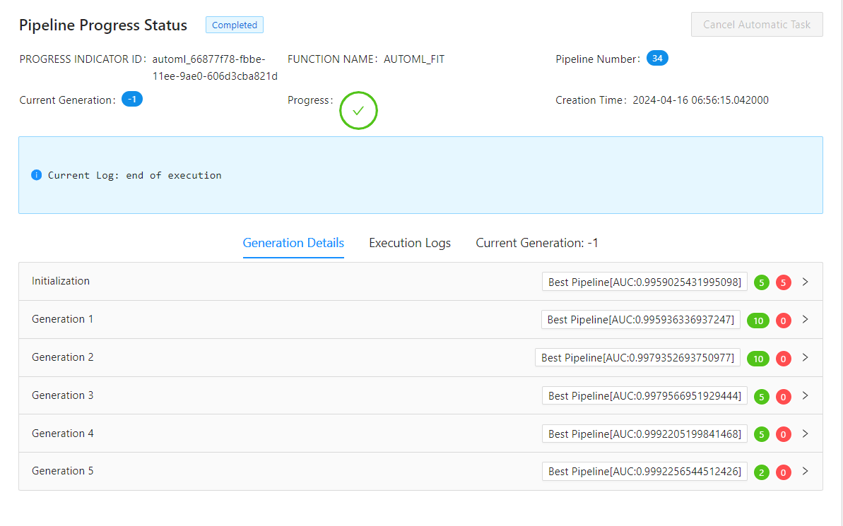
In order to cancel AutoML execution on the BAS or VSCode platform, you must import the Visual Studio Code Extension (VSIX) manually.
Follow the image below to install hanamlapi-monitor-1.2.0.vsix file on VSCode or BAS.
Methods
start()Call the method before executing the fit method of Automatic Object.
- start()
-
Call the method before executing the fit method of Automatic Object.


- class hana_ml.visualizers.automl_progress.SimplePipelineProgressStatusMonitor(connection_context: ConnectionContext, fetch_table_interval=1, runtime_platform=None)
-
An instance of this class offers functionality to monitor and track the progress of AutoML's execution at any given time through the progress_indicator_id.
- Parameters:
-
- connection_context
ConnectionContext -
The connection to the SAP HANA system.
- fetch_table_intervalfloat, optional
-
Specifies the time interval of fetching the table of pipeline progress.
Defaults to 1s.
- runtime_platformstr, optional
-
Specify the running environment of the monitor.
-
'console': output content in plain text format.
-
'jupyter': running on the JupyterLab or Jupyter Notebook platform.
-
'vscode': running on the VSCode platform.
-
'bas': running on the SAP Business Application Studio platform.
-
'databricks': running on the Databricks platform.
By default, the running platform will be automatically detected. If an incorrect value is passed in, this parameter will be ignored.
Defaults to None.
-
- connection_context
Examples
Create an AutomaticClassification instance:
>>> progress_id = "automl_{}".format(uuid.uuid1())
>>> auto_c = AutomaticClassification(generations=5,
                                     population_size=10,
                                     offspring_size=10,
                                     progress_indicator_id=progress_id)
>>> auto_c.enable_workload_class("MY_WORKLOAD")
Establish a SimplePipelineProgressStatusMonitor object and invoke start():
>>> progress_status_monitor = SimplePipelineProgressStatusMonitor(connection_context=dataframe.ConnectionContext(url, port, user, pwd))
>>> progress_status_monitor.start(progress_indicator_id=progress_id, highlight_metric='ACCURACY')
>>> auto_c.fit(data=df_train)
Output:
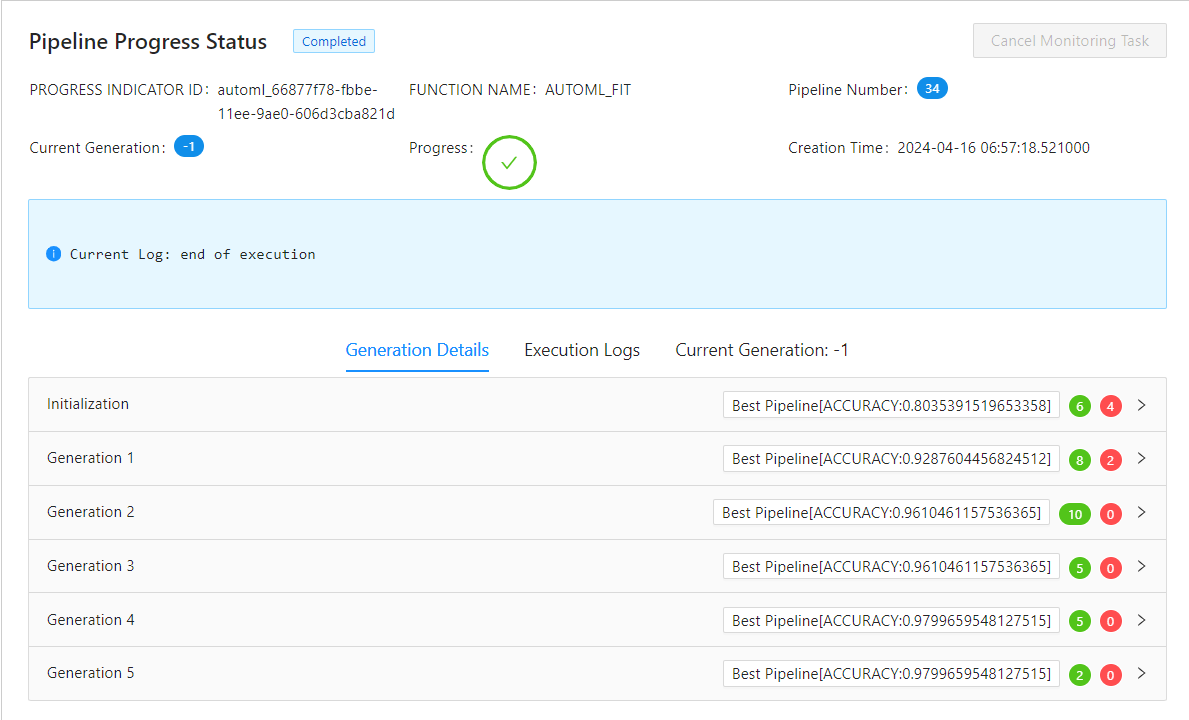
In order to cancel monitor execution on the BAS or VSCode platform, you must import the Visual Studio Code Extension (VSIX) manually.
Follow the image below to install hanamlapi-monitor-1.2.0.vsix file on VSCode or BAS.
Methods
start(progress_indicator_id[, highlight_metric])This method can be called at any time.
- start(progress_indicator_id, highlight_metric=None)
-
This method can be called at any time.
- Parameters:
-
- progress_indicator_idstr
-
A unique identifier which represents the ongoing automatic task.
- highlight_metricstr, optional
-
Specify the metric that need to be displayed on the UI.

hana_ml.visualizers.automl_report
This module contains related class for generating the best pipeline report.
The following class is available:
- class hana_ml.visualizers.automl_report.BestPipelineReport(automatic_obj)
-
Bases:
objectThe instance of this class can generate the best pipeline report.
- Parameters:
-
- automatic_obj
AutomaticClassificationorAutomaticRegressionorAutomaticTimeSeries -
An instance of the AutomaticClassification / AutomaticRegression / AutomaticTimeSeries Class.
- automatic_obj
Examples
Create an AutomaticClassification instance:
>>> progress_id = "automl_{}".format(uuid.uuid1())
>>> auto_c = AutomaticClassification(generations=2,
                                     population_size=5,
                                     offspring_size=5,
                                     progress_indicator_id=progress_id)
Training:
>>> auto_c.fit(data=df_train)
Plot the best pipeline:
>>> BestPipelineReport(auto_c).generate_notebook_iframe()

Methods
generate_html(filename)Saves the best pipeline report as a html file.
generate_notebook_iframe([iframe_height])Renders the best pipeline report as a notebook iframe.
- generate_notebook_iframe(iframe_height: int = 1000)
-
Renders the best pipeline report as a notebook iframe.
- Parameters:
-
- iframe_heightint, optional
-
Frame height.
Defaults to 1000.
- generate_html(filename: str)
-
Saves the best pipeline report as a html file.
- Parameters:
-
- filenamestr
-
Html file name.
hana_ml.visualizers.time_series_report
This module represents the whole time series report. A report can contain many pages, and each page can contain many items. You can use the class 'DatasetAnalysis' to generate all the items and combine them into different pages at will.
- The following classes are available:
- class hana_ml.visualizers.time_series_report.TimeSeriesReport(title: str)
-
Bases:
ReportBuilderThis class is the builder of time series report.
- Parameters:
-
- titlestr
-
The name of time series report.
Examples
-
Importing classes
>>> from hana_ml.visualizers.time_series_report import TimeSeriesReport, DatasetAnalysis
>>> from hana_ml.visualizers.report_builder import Page
-
Creating a report instance:
>>> report = TimeSeriesReport('Time Series Data Report')
-
Create a data analysis instance and a page array:
>>> dataset_analysis = DatasetAnalysis(data=df_acf, endog="Y", key="ID")
>>> pages = []
-
Construct the contents of each page of the report:
>>> page0 = Page('Stationarity')
>>> page0.addItem(dataset_analysis.stationarity_item())
>>> pages.append(page0)
>>> page1 = Page('Partial Autocorrelation')
>>> page1.addItem(dataset_analysis.pacf_item())
>>> pages.append(page1)
>>> page2 = Page('Rolling Mean and Standard Deviation')
>>> page2.addItems([dataset_analysis.moving_average_item(-3), dataset_analysis.rolling_stddev_item(10)])
>>> pages.append(page2)
>>> page3 = Page('Real and Seasonal')
>>> page3.addItem(dataset_analysis.real_item())
>>> page3.addItem(dataset_analysis.seasonal_item())
>>> page3.addItems(dataset_analysis.seasonal_decompose_items())
>>> pages.append(page3)
>>> page4 = Page('Box')
>>> page4.addItem(dataset_analysis.timeseries_box_item('YEAR'))
>>> page4.addItem(dataset_analysis.timeseries_box_item('MONTH'))
>>> page4.addItem(dataset_analysis.timeseries_box_item('QUARTER'))
>>> pages.append(page4)
>>> page5 = Page('Quarter')
>>> page5.addItem(dataset_analysis.quarter_item())
>>> pages.append(page5)
>>> page6 = Page('Outlier')
>>> page6.addItem(dataset_analysis.outlier_item())
>>> pages.append(page6)
>>> page7 = Page('Change Points')
>>> bcpd = BCPD(max_tcp=2, max_scp=1, max_harmonic_order =10, random_seed=1, max_iter=10000)
>>> page7.addItem(dataset_analysis.change_points_item(bcpd))
>>> pages.append(page7)
-
Add all pages to report instance:
>>> report.addPages(pages)
-
Generating notebook iframe:
>>> report.build()
>>> report.generate_notebook_iframe()
-
Generating a local HTML file:
>>> report.generate_html("TimeSeriesReport")
An example of time series data report is below:

Methods
addPage(page)Add a page instance to report instance.
addPages(pages)Add many page instances to report instance.
build([debug])Build HTML string based on current config.
generate_html(filename)Save the report as a html file.
generate_notebook_iframe([iframe_height])Render the report as a notebook iframe.
to_json()Return the all config data of report.
- addPage(page: Page)
-
Add a page instance to report instance.
- Parameters:
-
- pagePage
-
Every report consists of many pages.
- addPages(pages: List[Page])
-
Add many page instances to report instance.
- Parameters:
-
- pagesList[Page]
-
Every report consists of many pages.
- build(debug=False)
-
Build HTML string based on current config.
- Parameters:
-
- debugbool
-
Whether the log should be printed to the console.
Defaults to False.
- generate_html(filename)
-
Save the report as a html file.
- Parameters:
-
- filenamestr
-
HTML file name.
- generate_notebook_iframe(iframe_height=600)
-
Render the report as a notebook iframe.
- Parameters:
-
- iframe_heightint
-
iframe height.
Defaults to 600.
- to_json()
-
Return the all config data of report. This method is automatically called by the internal framework.
- class hana_ml.visualizers.time_series_report.DatasetAnalysis(data, endog, key=None)
-
Bases:
objectThis class will generate all items of dataset analysis result.
- Parameters:
-
- dataDataFrame
-
Input data.
- endogstr
-
Name of the dependent variable.
- keystr, optional
-
Name of the ID column.
Defaults to the index column of
data(i.e. data.index) if it is set.
Methods
change_points_item(cp_object[, ...])Plot time series with the highlighted change points and BCPD is used for change point detection.
moving_average_item(rolling_window)It will plot rolling mean by given rolling window size.
outlier_item([window_size, ...])Perform PAL time series outlier detection and plot time series with the highlighted outliers.
pacf_item([thread_ratio, method, max_lag, ...])It will plot PACF for two time series data.
It performs quarter plot to view the seasonality.
It will plot a chart based on the original data.
rolling_stddev_item(rolling_window)It will plot rolling standard deviation by given rolling window size.
seasonal_decompose_items([alpha, ...])It will to decompose a time series into three components: trend, seasonality and random noise, then to plot.
It will plot time series data by year.
stationarity_item([method, mode, lag, ...])Stationarity means that a time series has a constant mean and constant variance over time.
timeseries_box_item([cycle])It will plot year-wise/month-wise box plot.
- pacf_item(thread_ratio=None, method=None, max_lag=None, calculate_confint=True, alpha=None, bartlett=None)
-
It will plot PACF for two time series data.
- Parameters:
-
- colstr
-
Name of the time series data column.
- thread_ratiofloat, optional
-
The ratio of available threads.
-
0: single thread
-
0~1: percentage
-
Others: heuristically determined
Valid only when
methodis set as 'brute_force'.Defaults to -1.
-
- method{'auto', 'brute_force', 'fft'}, optional
-
Indicates the method to be used to calculate the correlation function.
Defaults to 'auto'.
- max_lagint, optional
-
Maximum lag for the correlation function.
- calculate_confintbool, optional
-
Controls whether to calculate confidence intervals or not.
If it is True, two additional columns of confidence intervals are shown in the result.
Defaults to True.
- alphafloat, optional
-
Confidence bound for the given level are returned. For instance if alpha=0.05, 95 % confidence bound is returned.
Valid only when only
calculate_confintis True.Defaults to 0.05.
- bartlettbool, optional
-
-
False: using standard error to calculate the confidence bound.
-
True: using Bartlett's formula to calculate confidence bound.
Valid only when only
calculate_confintis True.Defaults to True.
-
- Returns:
-
- itemChartItem
-
The item for the plot.
- moving_average_item(rolling_window)
-
It will plot rolling mean by given rolling window size.
- Parameters:
-
- rolling_windowint, optional
-
Window size for rolling function. If negative, it will use the points before CURRENT ROW.
- Returns:
-
- itemChartItem
-
The item for the plot.
- rolling_stddev_item(rolling_window)
-
It will plot rolling standard deviation by given rolling window size.
- Parameters:
-
- rolling_windowint, optional
-
Window size for rolling function. If negative, it will use the points before CURRENT ROW.
- Returns:
-
- itemChartItem
-
The item for the plot.
- seasonal_item()
-
It will plot time series data by year.
- Returns:
-
- itemChartItem
-
The item for the plot.
- timeseries_box_item(cycle=None)
-
It will plot year-wise/month-wise box plot.
- Parameters:
-
- cycle{"YEAR", "QUARTER", "MONTH", "WEEK"}, optional
-
It defines the x-axis for the box plot.
- Returns:
-
- itemChartItem
-
The item for the plot.
- seasonal_decompose_items(alpha=None, thread_ratio=None, decompose_type=None, extrapolation=None, smooth_width=None)
-
It will to decompose a time series into three components: trend, seasonality and random noise, then to plot.
- Parameters:
-
- alphafloat, optional
-
The criterion for the autocorrelation coefficient. The value range is (0, 1). A larger value indicates stricter requirement for seasonality.
Defaults to 0.2.
- thread_ratiofloat, optional
-
Controls the proportion of available threads to use. The ratio of available threads.
-
0: single thread.
-
0~1: percentage.
-
Others: heuristically determined.
Defaults to -1.
-
- decompose_type{'additive', 'multiplicative', 'auto'}, optional
-
Specifies decompose type.
-
'additive': additive decomposition model
-
'multiplicative': multiplicative decomposition model
-
'auto': decomposition model automatically determined from input data
Defaults to 'auto'.
-
- extrapolationbool, optional
-
Specifies whether to extrapolate the endpoints. Set to True when there is an end-point issue.
Defaults to False.
- smooth_widthint, optional
-
Specifies the width of the moving average applied to non-seasonal data. 0 indicates linear fitting to extract trends. Can not be larger than half of the data length.
Defaults to 0.
- Returns:
-
- itemChartItem
-
The item for the plot.
- quarter_item()
-
It performs quarter plot to view the seasonality.
- Returns:
-
- itemChartItem
-
The item for the plot.
- outlier_item(window_size=None, detect_seasonality=None, alpha=None, periods=None, outlier_method=None, threshold=None, **kwargs)
-
Perform PAL time series outlier detection and plot time series with the highlighted outliers.
- Parameters:
-
- window_sizeint, optional
-
Odd number, the window size for median filter, not less than 3.
Defaults to 3.
- outlier_methodstr, optional
-
The method for calculate the outlier score from residual.
-
'z1' : Z1 score.
-
'z2' : Z2 score.
-
'iqr' : IQR score.
-
'mad' : MAD score.
Defaults to 'z1'.
-
- thresholdfloat, optional
-
The threshold for outlier score. If the absolute value of outlier score is beyond the threshold, we consider the corresponding data point as an outlier.
Defaults to 3.
- detect_seasonalitybool, optional
-
When calculating the residual,
-
False: Does not consider the seasonal decomposition.
-
True: Considers the seasonal decomposition.
Defaults to False.
-
- alphafloat, optional
-
The criterion for the autocorrelation coefficient. The value range is (0, 1). A larger value indicates a stricter requirement for seasonality.
Only valid when
detect_seasonalityis True.Defaults to 0.2.
- periodsint, optional
-
When this parameter is not specified, the algorithm will search the seasonal period. When this parameter is specified between 2 and half of the series length, autocorrelation value is calculated for this number of periods and the result is compared to
alphaparameter. If correlation value is equal to or higher thanalpha, decomposition is executed with the value ofperiods. Otherwise, the residual is calculated without decomposition. For other value of parameterperiods, the residual is also calculated without decomposition.No Default value.
- thread_ratiofloat, optional
-
The ratio of available threads.
-
0: single thread.
-
0~1: percentage.
-
Others: heuristically determined.
Only valid when
detect_seasonalityis True.Defaults to -1.
-
- Returns:
-
- itemChartItem
-
The item for the plot.
- stationarity_item(method=None, mode=None, lag=None, probability=None)
-
Stationarity means that a time series has a constant mean and constant variance over time. For many time series models, the input data has to be stationary for reasonable analysis.
- Parameters:
-
- methodstr, optional
-
Statistic test that used to determine stationarity. The options are "kpss" and "adf".
Defaults "kpss".
- modestr, optional
-
Type of stationarity to determine. The options are "level", "trend" and "no". Note that option "no" is not applicable to "kpss".
Defaults to "level".
- lagint, optional
-
The lag order to calculate the test statistic.
Default value is "kpss": int(12*(data_length / 100)^0.25" ) and "adf": int(4*(data_length / 100)^(2/9)).
- probabilityfloat, optional
-
The confidence level for confirming stationarity.
Defaults to 0.9.
- Returns:
-
- itemTableItem
-
The item for the statistical data.
- real_item()
-
It will plot a chart based on the original data.
- Parameters:
-
- None
- Returns:
-
- itemChartItem
-
The item for the plot.
- change_points_item(cp_object, display_trend=True, cp_style='axvline', title=None)
-
Plot time series with the highlighted change points and BCPD is used for change point detection.
- Parameters:
-
- cp_objectBCPD object
-
An object of BCPD for change points detection. Please initialize a BCPD object first. An example is shown below:
- cp_style{"axvline", "scatter"}, optional
-
The style of change points in the plot.
Defaults to "axvline".
- display_trendbool, optional
-
If True, draw the trend component based on decomposed component of trend of BCPD fit_predict().
Default to True.
- titlestr, optional
-
The title of plot.
Defaults to "Change Points".
- Returns:
-
- itemChartItem
-
The item for the plot.
hana_ml.visualizers.automl_config
- class hana_ml.visualizers.automl_config.AutoMLConfig(config_dict: str | dict = 'classification', iframe_height: int = 500)
-
Generates the AutoML Config UI.

- Parameters:
-
- config_dictdict | str, optional
-
Manually set the custom config_dict.
If this parameter is not specified, the classification config template is used.
Defaults to 'classification'.
- iframe_heightint, optional
-
IFrame height.
Defaults to 500.
Methods
generate_html(file_name)Generate an HTML file.
Get the latest config dict from UI.
- generate_html(file_name)
-
Generate an HTML file.
- Parameters:
-
- file_namestr
-
HTML file name.
- get_config_dict()
-
Get the latest config dict from UI.
Without Visual Studio Code Extension (VSIX), calling the get_config_dict method on VSCode or BAS platforms will fail.
Follow the image below to install hanamlapi-monitor-1.2.0.vsix file on VSCode or BAS.
